Sair
"A better way to plan trips with friends"
Duration
3 weeks
Tools
Sketch,
Framer X,
Adobe Illustrator
Project Type
Solo
Responsibilities
Interaction Design
Visual Design
User Research
Overview
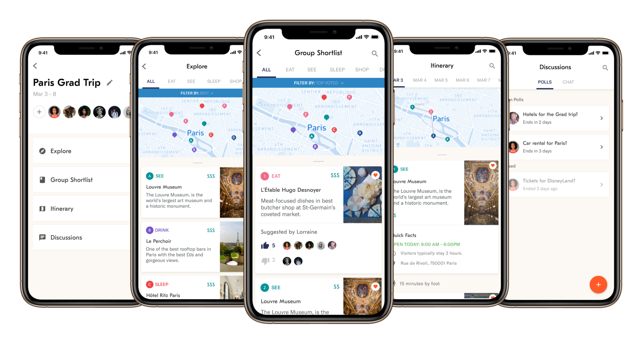
Sair is a collaborative trip planning app which makes planning group travel easy, so you can spend your trip doing things you love.
Sair's key features are: a collaborative shortlist where people in the group can add things and vote on to build consensus, unique way to explore places and timed polls to keep track of decisions which need to be made.
Introduction
Recently, I went on a trip to Miami with my college friends.
- Booking the flight tickets was easy: deciding which dates to book as a group was hard.
- Booking the place to stay was easy: deciding which place to stay as a group was hard.
- Going places was easy: reaching a consensus on where to go was seemingly impossible.
We used a chat group for our all our planning as a group, here's a glimpse of what it looked like:
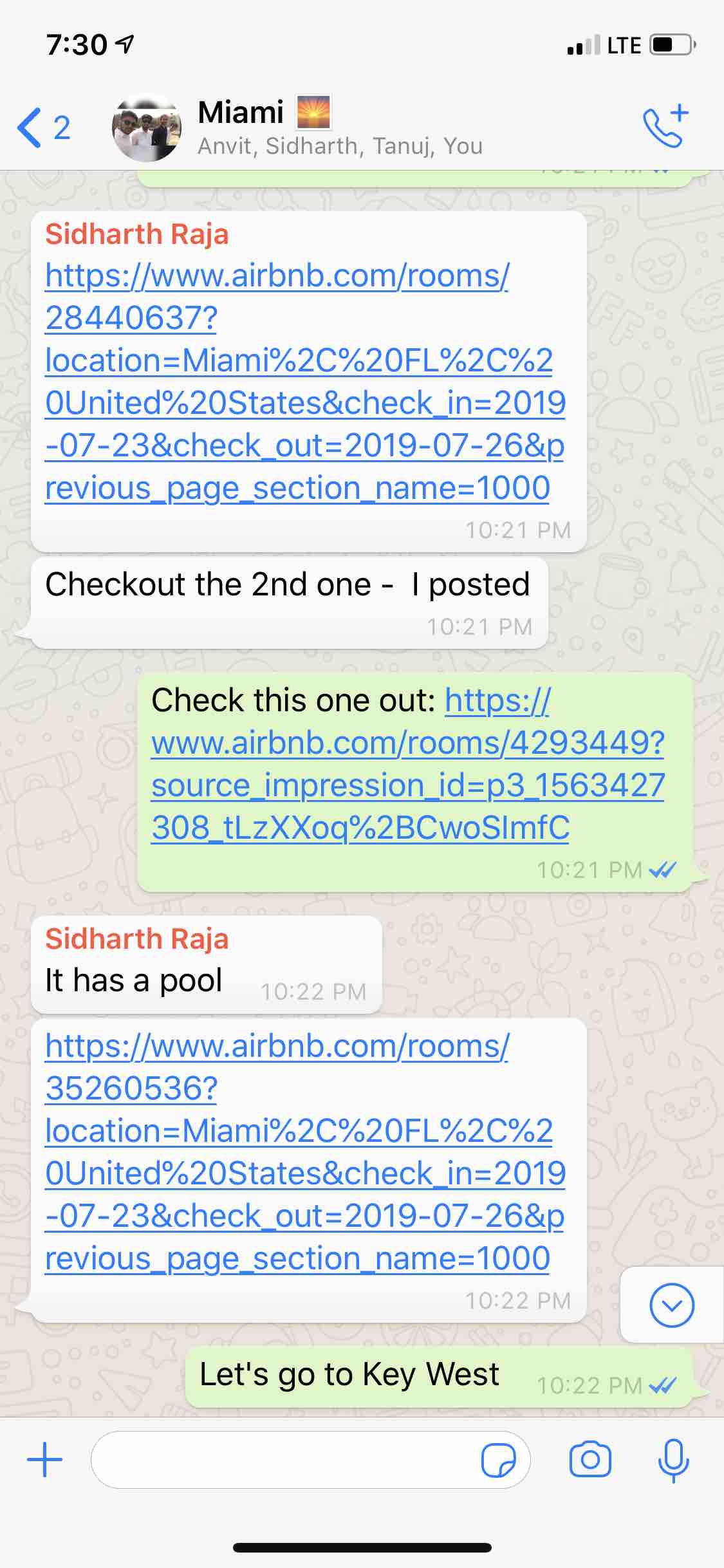
The process was chaotic
+ lots of links
+ difficulty to track
+ loss of context
= no consensus!
As a result, we ended up spending a lot of time Googling during the trip instead of enjoying our time. At the end of my trip, I wondered how can we create a better experience for groups going on a trip?
Opportunity Statement
How can we streamline the process of planning trips within a group: exploring places, building consensus and creating a flexible itinerary?
Understanding the current market
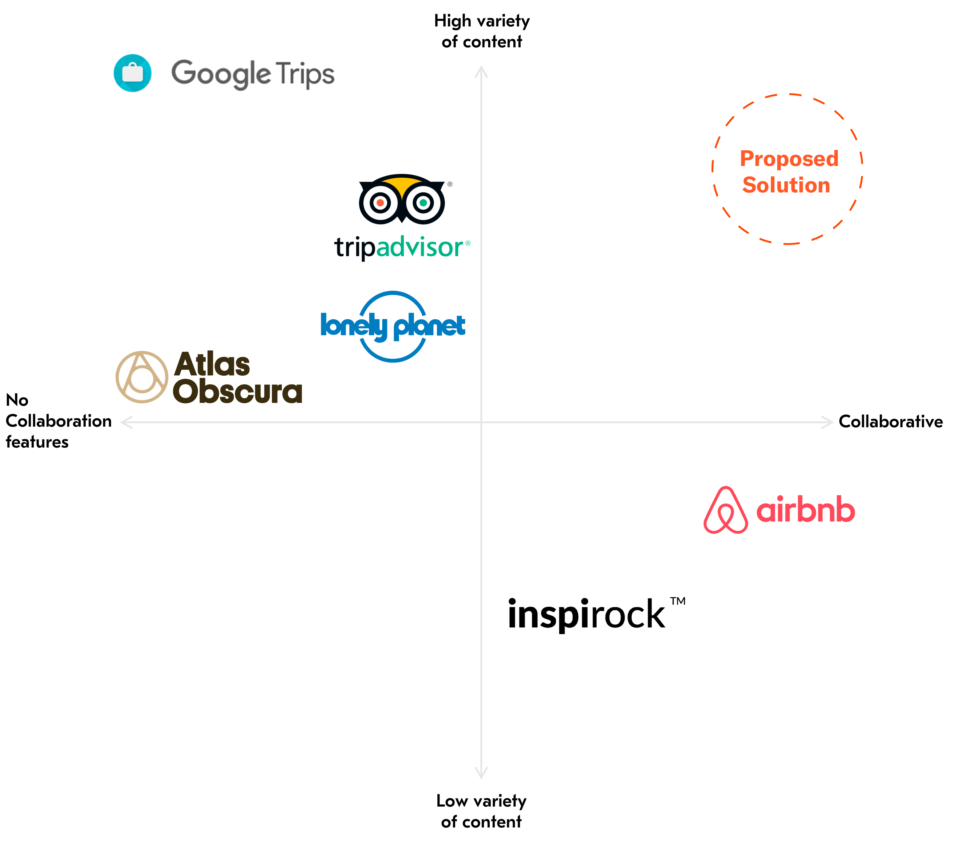
To begin my exploration, I started my research to understand the current products on the market and how they support collaborative planning. There were a plethora of apps on the market, I tried to research apps which support creating itineraries, exploration and consensus building while planning.

Competitive Analysis
Most of these apps had some aspect of the planning process but there was no one-stop solution for planning on the market. Moreover, most of these products have an emphasis on selling promoted content rather than aiding travelers.
Quick Peek at the Solution
Sair is a collaborative trip planning app which makes planning easy, so you can spend your trip doing things you
Explore
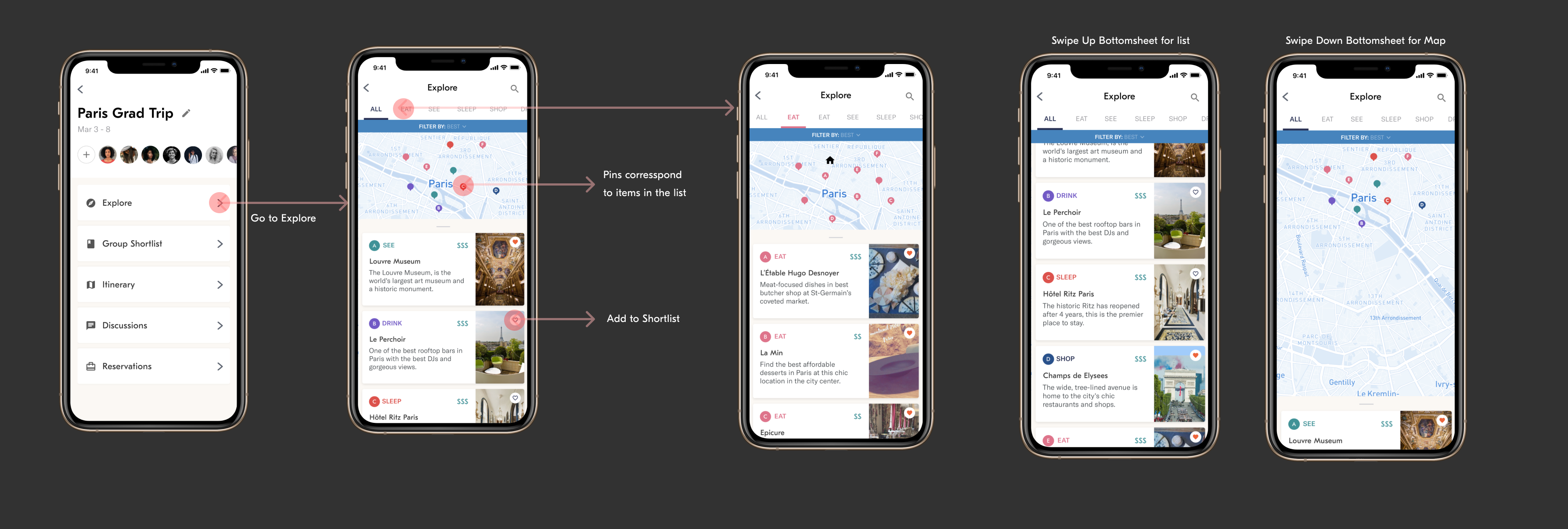
Use the unique map/list interface to find places you want to visit and to save them to a shortlist.
Vote to build consensus
Once there are items in the common shortlist, people can vote to decide what the group should do.
Polls to decide everything else
You can create timed polls to make decisions fast and keep track of who has let their opinion known.
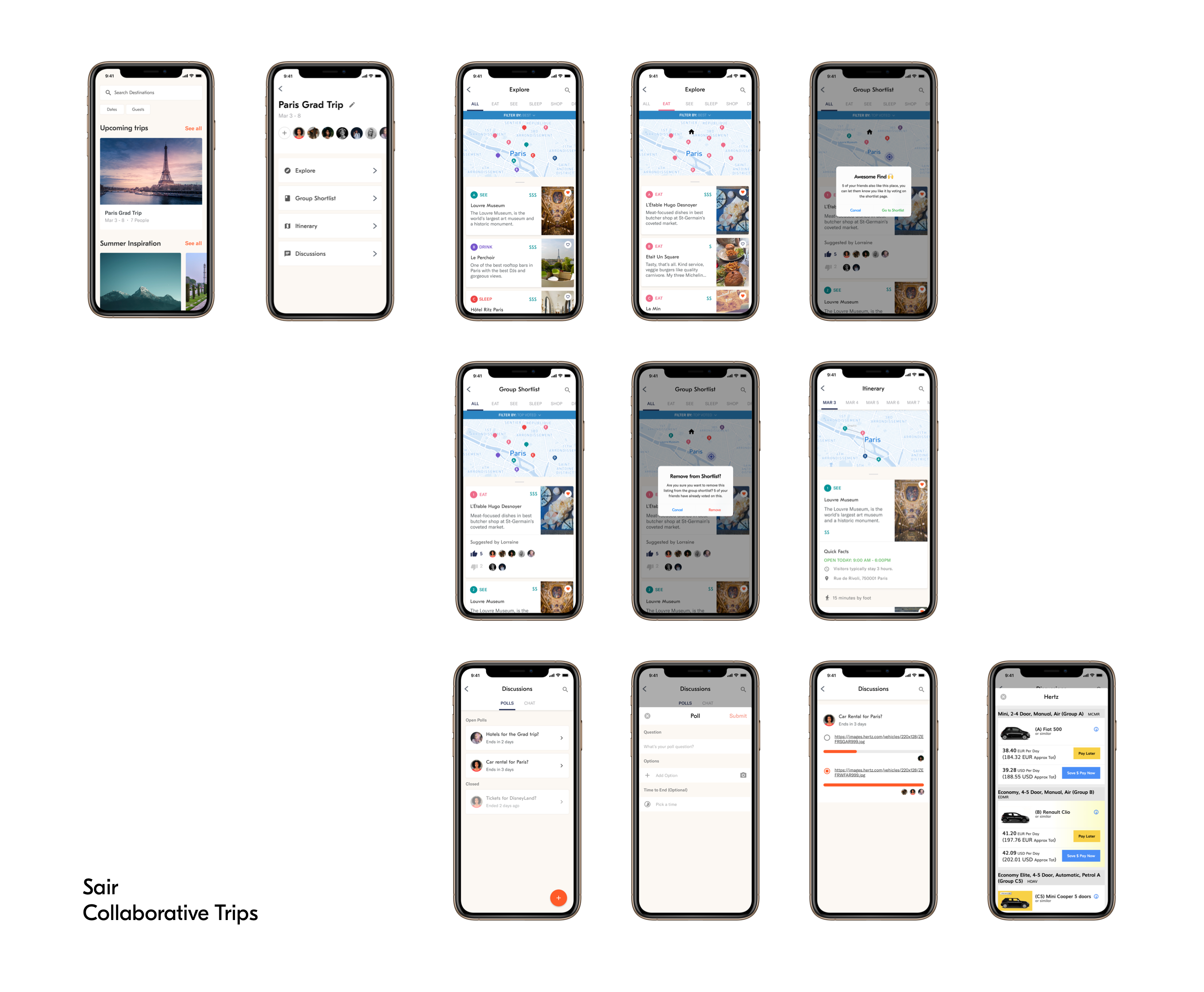
The Complete Process
How do small groups plan their trips?
To build empathy for my users, I interviewed 8 people to gather different perspectives and see what were the major problems that people face when planning trips in a group. I was trying to understand these things:
- What is the exact process in which people plan trips?
- How do people collaborate: online vs offline?
- How do people collaborate: online vs offline?
- What do final itineraries look like?
- Do people even create an itinerary?
- If yes, how detailed are these itineraries?
- How do people build consensus?
- Where to go, what to do and different parts of the trip?
- How are decisions tracked?
- How do people communicate in a group?
- What kind of things are people talking about?
Based on these research questions, I fleshed out an interview protocol and talked to people. After talking to people, I came to a conclusion that there are two types of people in a group:
The Planners and the Passive Participants
After talking to people, I realized that there are two types of people on a group that is planning a trip:
1. The Planners
The first kind of person who participates in the group trip planning is the planner. Planners usually do a lot of research and want to create a plan that has something for everyone.
2. The Passive Participant
The other kind of person who participates in the group trip planning is the passive participant. They usually don't want to participate in the planning and are happy with whatever the plan is, however, they enjoy expressing their opinions and staying up to date with the plan.
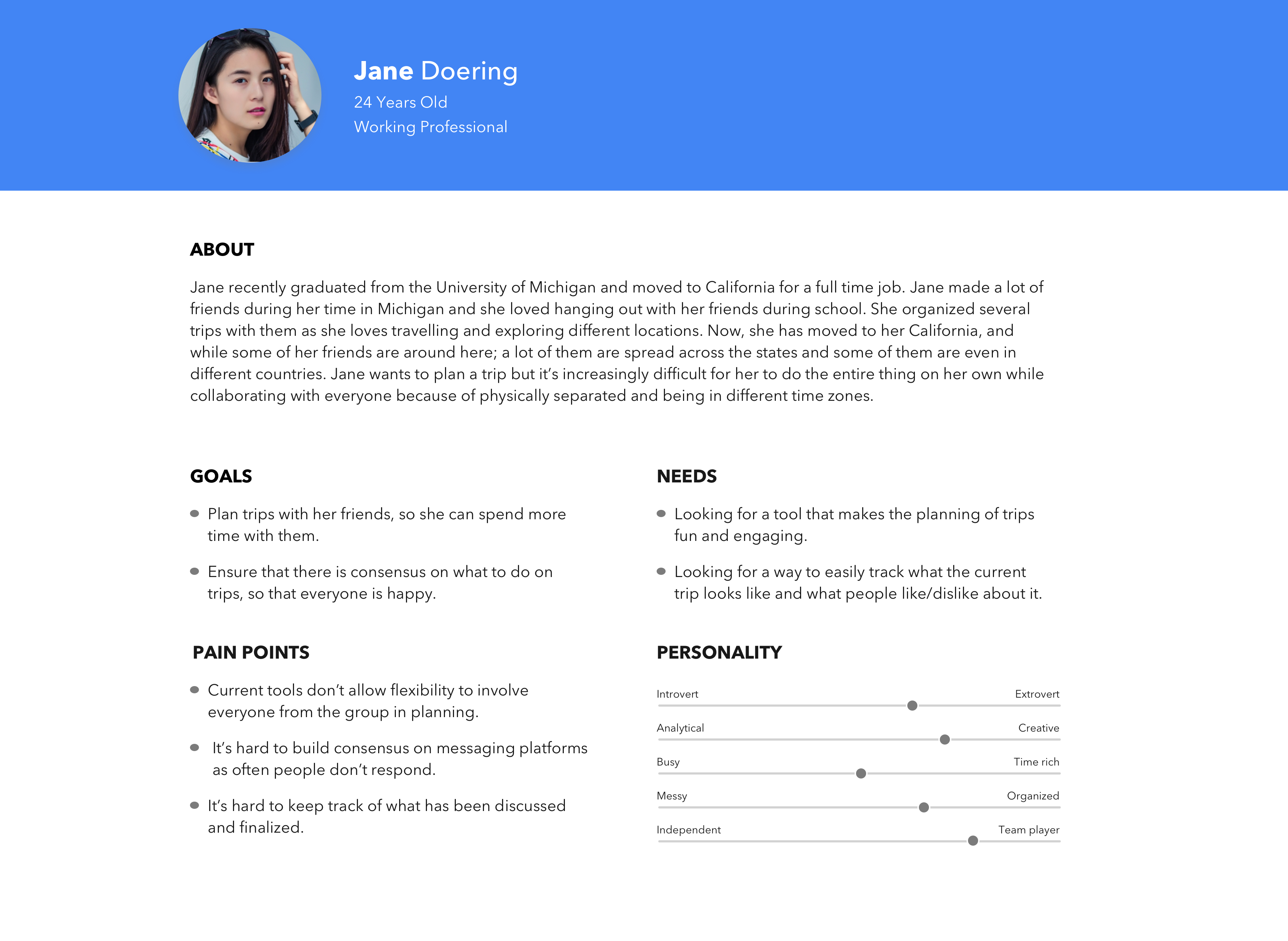
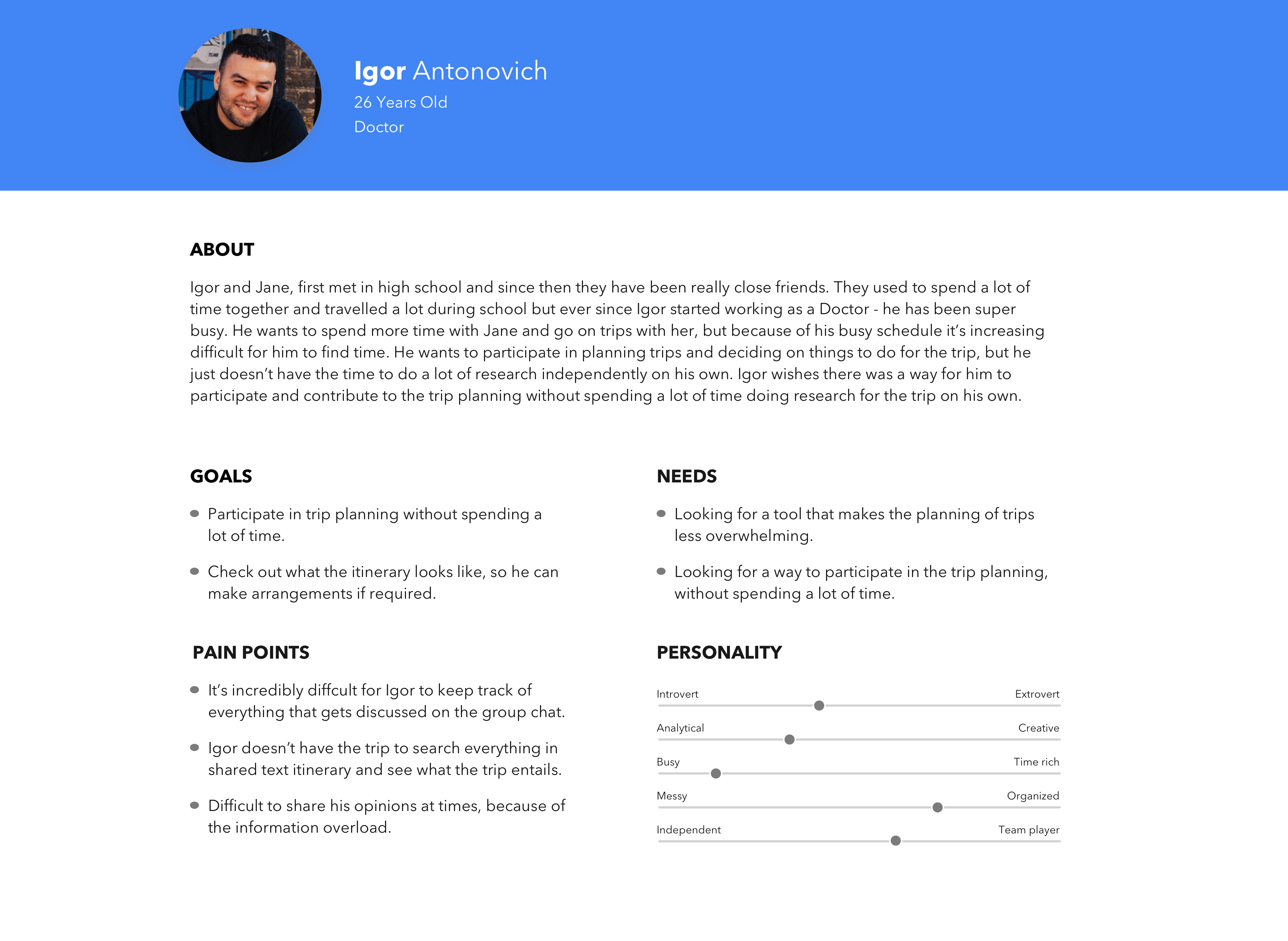
Persona building to empathise and understand the frustrations of the users
To synthesize my research and understanding of the users, I created personas to map their behaviors, frustrations, goals, and needs.
Insights
What does the Planning Process look like?
The beginning of any trip starts with individual research, where people usually determine the must-see places and then explore things which they would like to do if they have extra time! The final step is to store the list of things to do on a text-based list or as pins on a map.

What do itineraries look like?
From my research, I learned that people who are going on a trip to relax/hang out with friends don't like creating very detailed itineraries.
In this case, instead of looking like an elaborate plan with things to do defined for every hour, the itinerary looks like one of the following things:
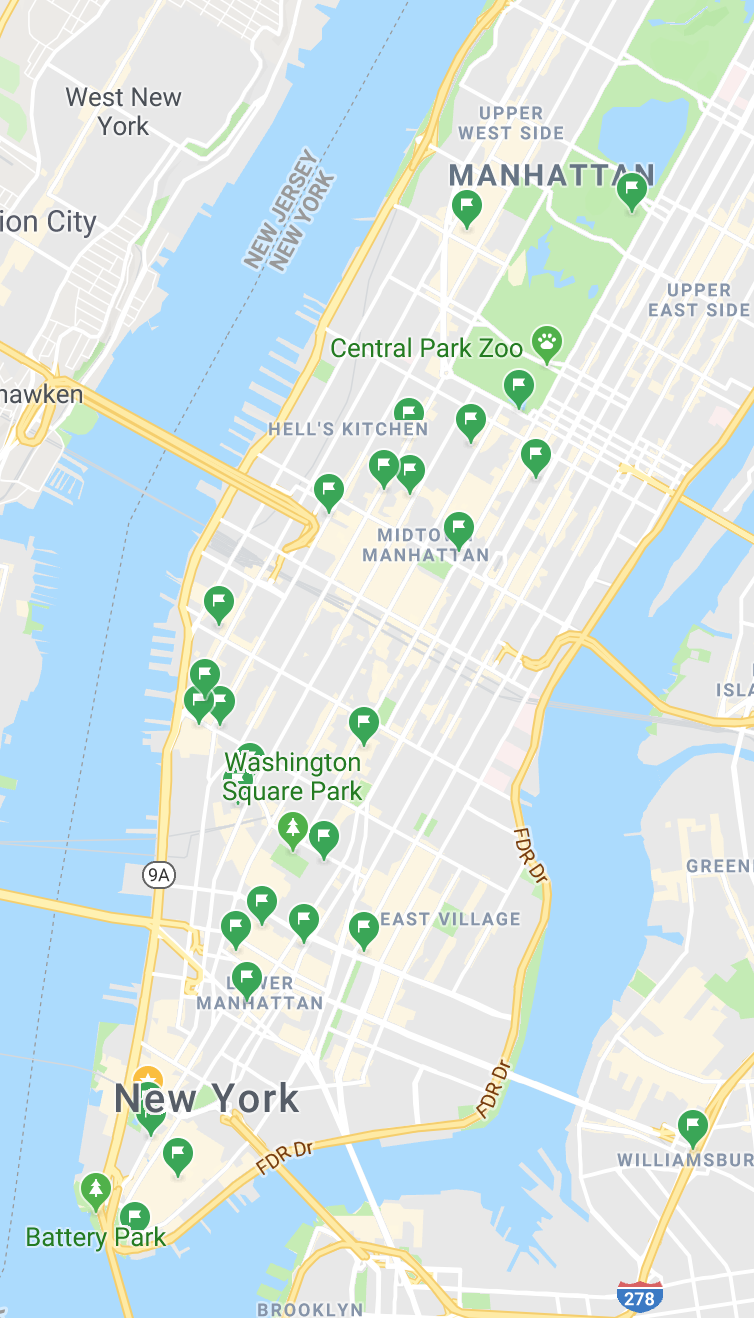
Itinerary in form of Map Pins
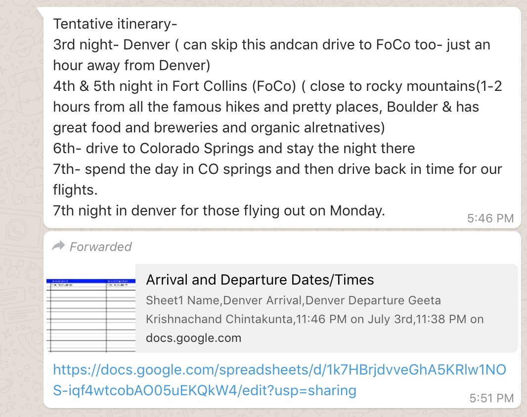
Text-Based Itineraries
For the Passive Participant, in the case of text-based itineraries - it is difficult to explore the itinerary as they need to Google everything which is a lot of work.
Building Consensus and Communicating
When planning out a trip in a group, one of the major pain-points is building consensus and communicating with people. Currently, people use a group chat which has several problems associated with it:
- hard to read all the messages which were sent when you were not online
- hard to keep track of what everyone's opinion is
- hard to tackle time-sensitive events
- hard to keep track of who is participating and who is not
- hard to know whether other people like the places/things which have been shared
Mapping out a "better" experience for planners
With my insights, I knew about the two types of planners on a trip. Keeping the different personas - the Planner and the Passive Participant in mind, I mapped out a planning experience which was delightful for both the actors.
The Planners of a group can participate in Steps 1, 2 and 3. The Passive Participants who were limited to only viewing final itineraries can now participate in the planning by letting the group know their opinion by voting.
Designing the Information Architecture for Sair
Mapping the high-level user flow helped me visualize the system abstractly. To develop a better picture of what the final system, I mapped out the important system components, inputs, functions and architecture using Do-Go map.
Use drag and pinch-to-zoom actions to explore the Do-Go Map
The Do-Go Map helped me understand the different parts of the system and how they relate and interact with each other. After creating this information architecture, I knew what functions I need to support each part of the system.
Designing Sair
Designing an intuitive way to explore
After researching how current apps on the market show this variety of content, I realized that there were two popular approaches to showing this information.
- List-based: A text-based list with images and other important information like location, timings and so on.
- Map-based: A map-based list has pins which can be clicked to see more information. This view gives people context of where the thing is but often it's hard to quickly view information as you need to switch between views.
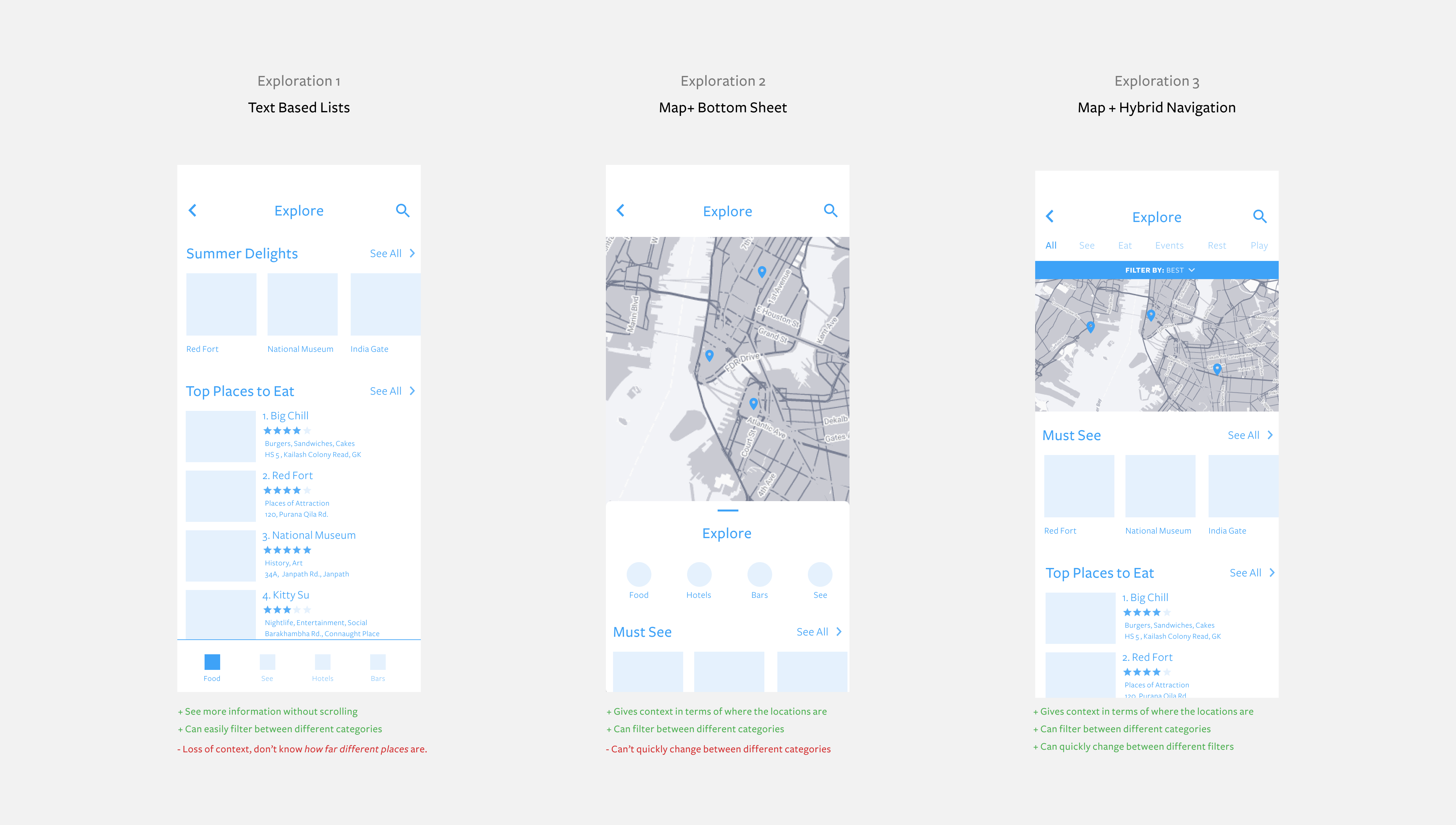
After considering the Pros and Cons of each approach, I ended up going with the third approach, as it gave users the most flexibility combining the pros of lists and maps
Designing a coherent map/list experience
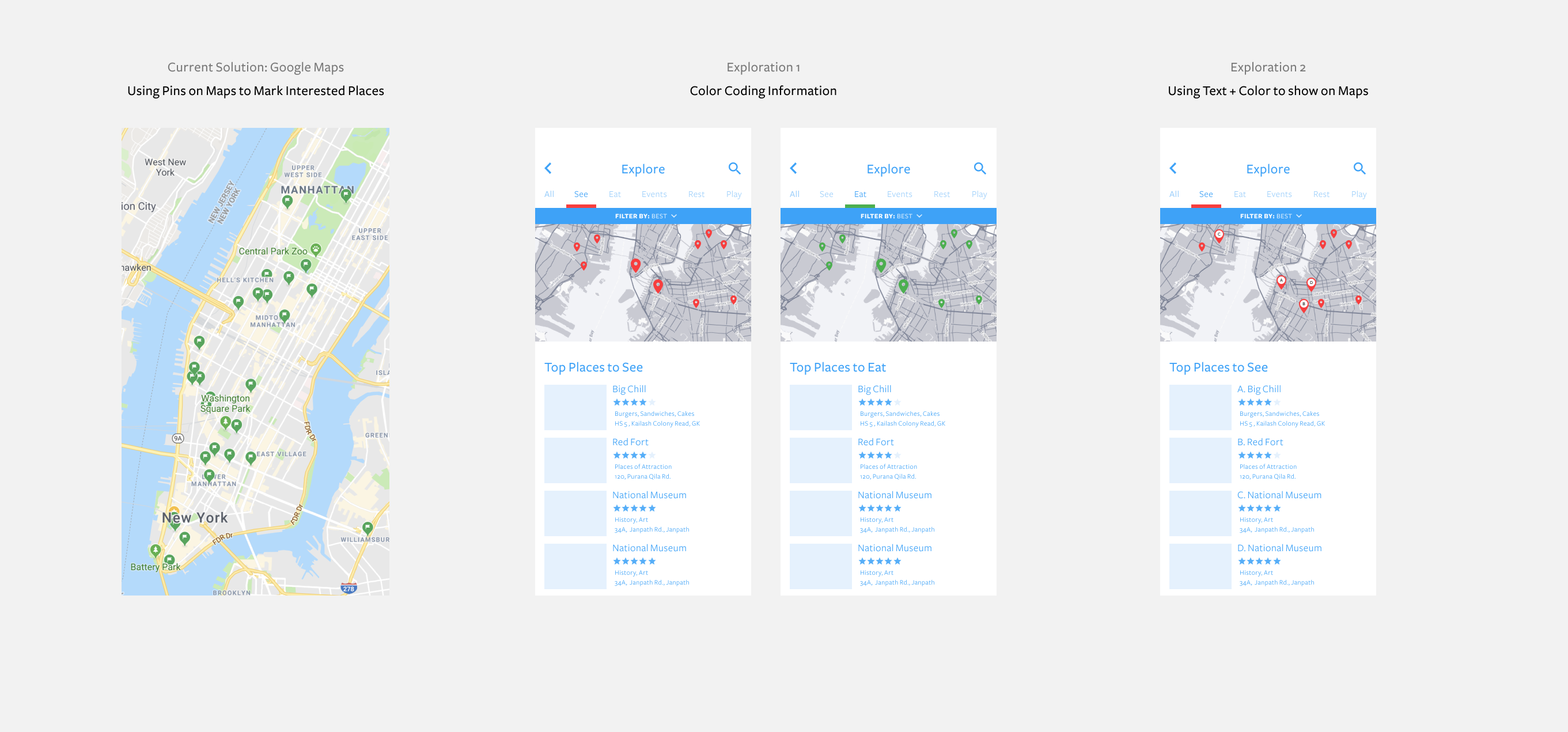
A key component of the explore page is supporting exploration using combined lists and map pins. During my research, a participant shared that when they use Google Map pins as shown below, it is difficult to tell pins apart and hard to get information at a glance about what represents what in the set of pins.
I brainstormed different ways to encode data as shown below: first using color, and then using color along with the text. I ended up choosing the second exploration as it seemed more intuitive, combined maps and pins and at the same time were more accessible. Encoding information with both color and text ensures that people who might have color disabilities can still use the text to identify pins!
After designing the pins, the next thing which I did was think about the overall flow and how would things in the big picture look like. Here is the final design:
Designing the collaborative shortlist
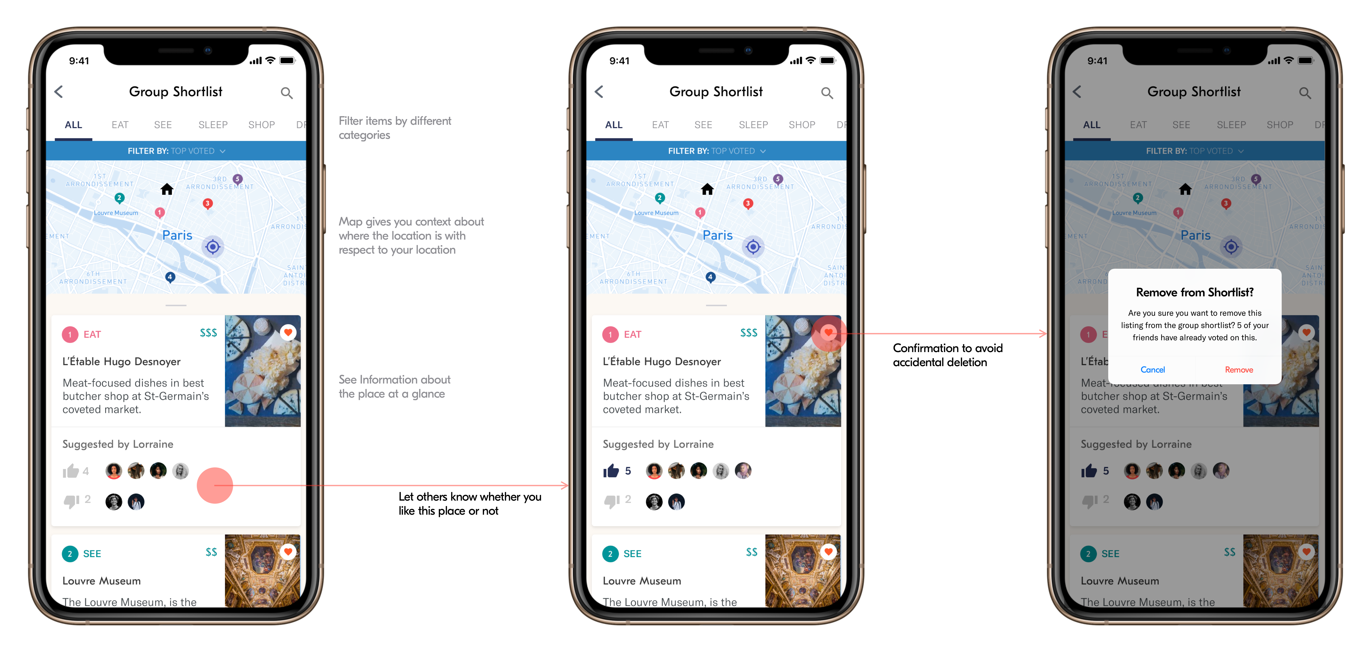
One of the key features of Sair is the collaborative shortlist which lets people build consensus while planning. Leveraging the designs I had for map/list based exploration, I chose to design the collaborative shortlist around it. The reason why I chose to reuse the design was that not everyone in the group might be familiar with the items on the shortlist; therefore, they might need more context in terms of location, category and so on before voting.
After my exploration, I realized that Starring items individually would require making a decision and people will need to spend more time to do it. Emojis, on the other hand, seemed like a fun way to rate places, but at the same time everyone interprets emojis in different ways and hence, it would be hard to understand what the final rating is.
I finally, decide to go with a simple voting mechanism where people can upvote or downvote, and the final rating of the item is decided by the difference between upvotes and downvotes.
Handling Edge Cases
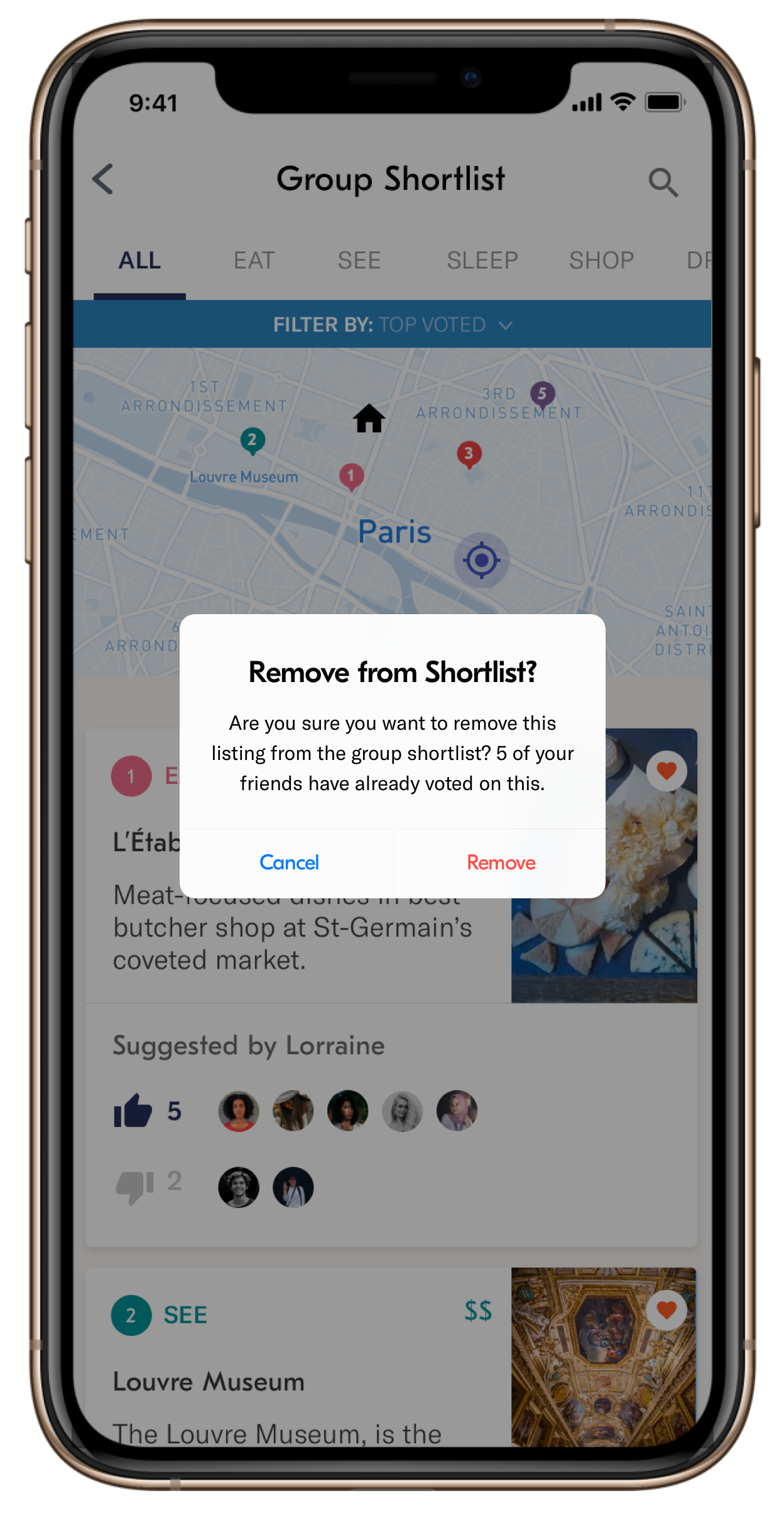
Preventing accidental deletion from the
Anytime the user is trying to remove an item from the group shortlist - the app asks for confirmation to make the action of deletion more deliberate.
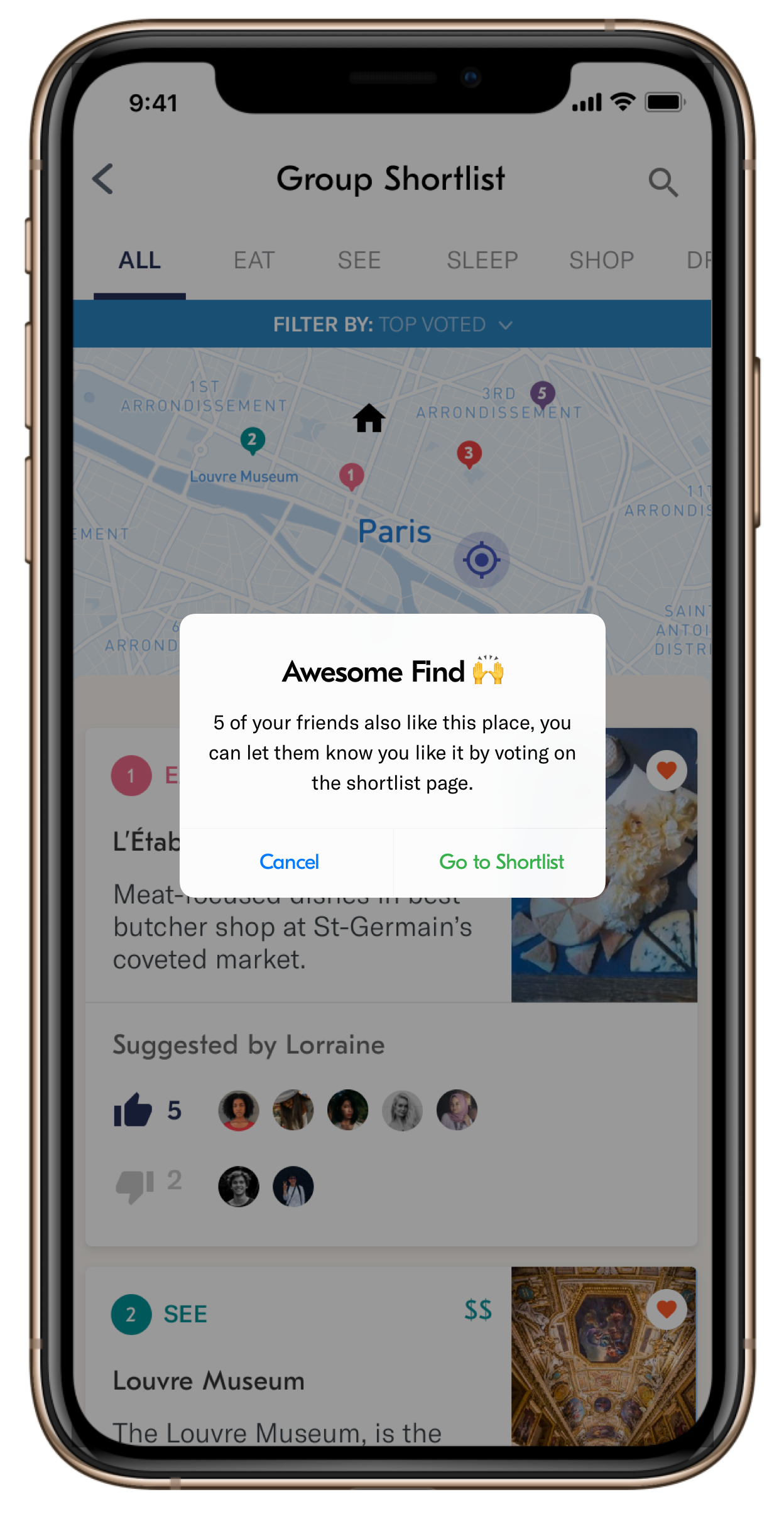
What if the place I am trying to add has already been added?
If the item being added is already in the list, the app lets the user know and directs them to the Shortlist where they can vote on the app.
Design Work
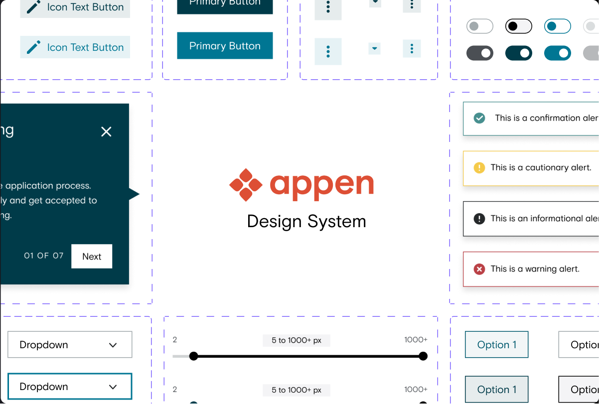
Appen RebrandProject type
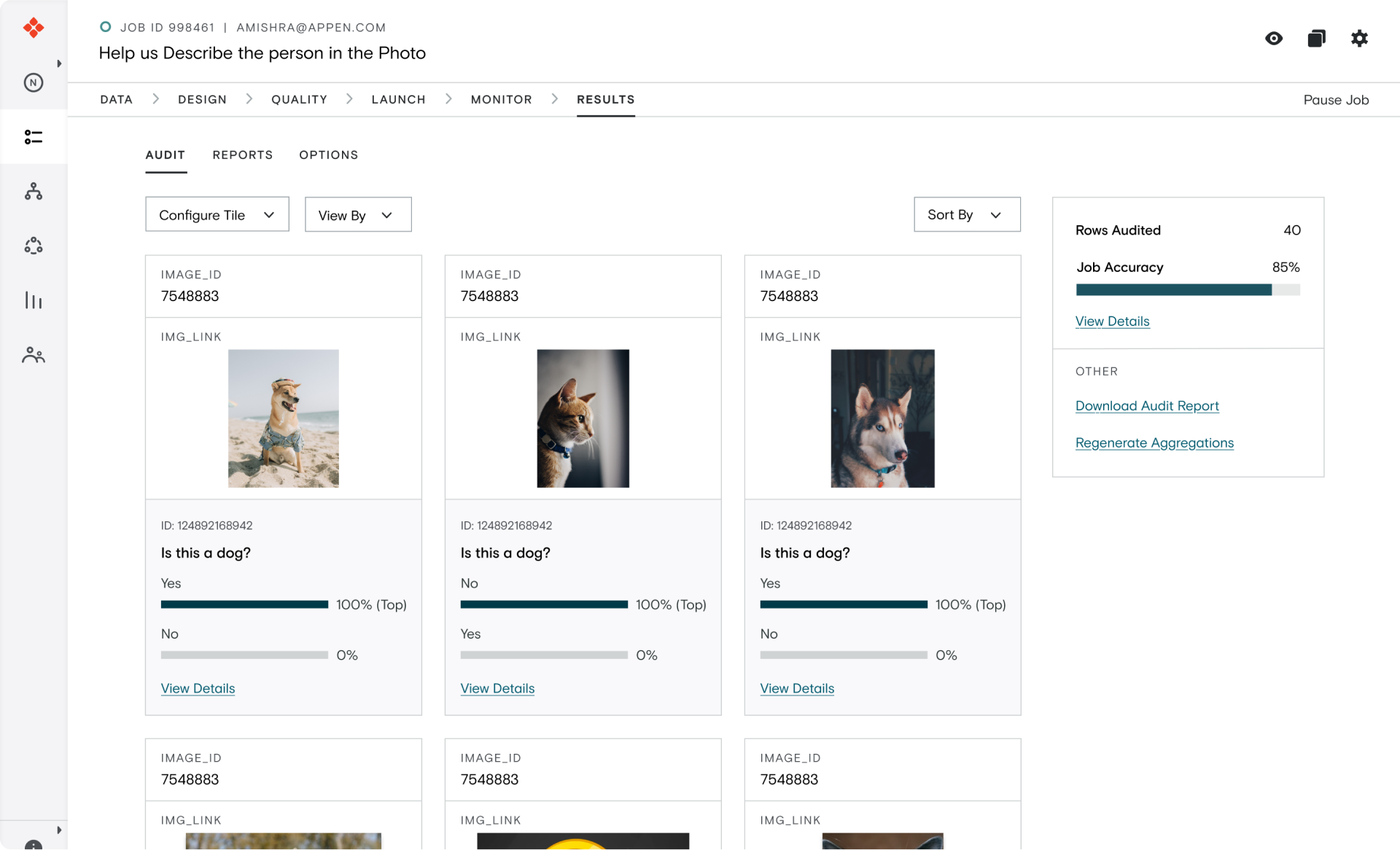
IPAProject type
© Akshat Mishra
Currently working from the Mission District, San Francisco

