In-Platform Audit
Enabling Data Scientists to explore and audit their labeled datasets to minimize bias in AI Models.
Appen collects and labels different forms of data (images, text, audio, video etc) to support Data Scientists building the world’s most innovative artificial intelligence systems.
A critical job that Data Scientists need to perform before using this labeled data in their models is to review the quality of data labels to ensure that the system is not learning gibberish.
In-Platform Audit aims to simplify and accelerate this audit process to ensure Data Scientists have greater insight into their data before training a machine learning model.
tl;dr:
User Problem
To train a machine learning model Data Scientists use labeled data. Appen helps Data Scientists in collecting and labeling data, however, before using this labeled dataset data scientists need to audit and review their datasets to ensure that the datapoints that they will use to train their models are accurate. The curent experience for auditing is cumbersome and required a lot of manual slicing and dicing of data.
HMW make the experience of auditing more streamlined for our customers and support them in building the world's best Artificial Intelligence Systems?
Business Goals
- Increase stickiness and activation in our customers by building a solution to solve one of their most pressing needs.
- Free up engineering resources for our customers which they are currently using to support custom auditing tools.
- Differentiate from our competitors by providing a seamless auditing experience.
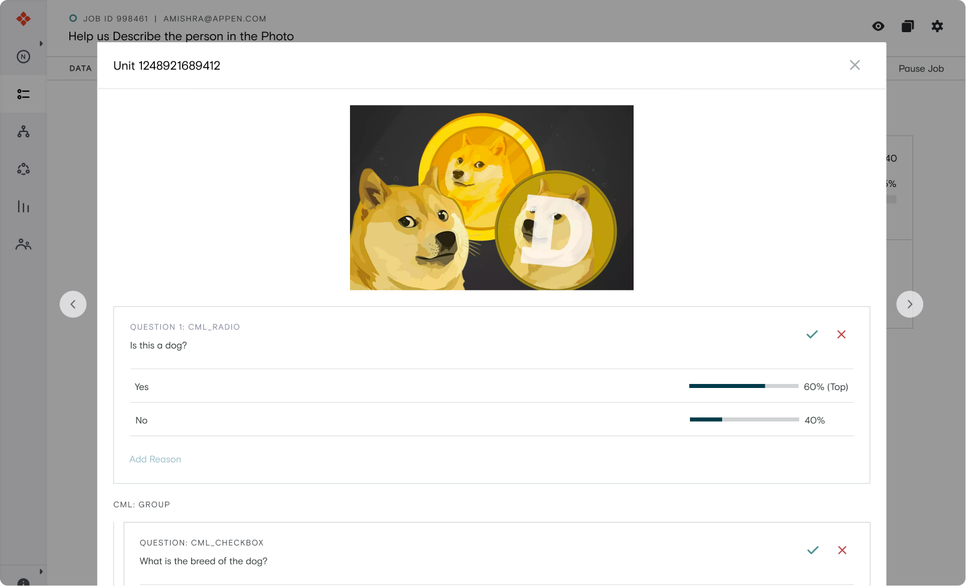
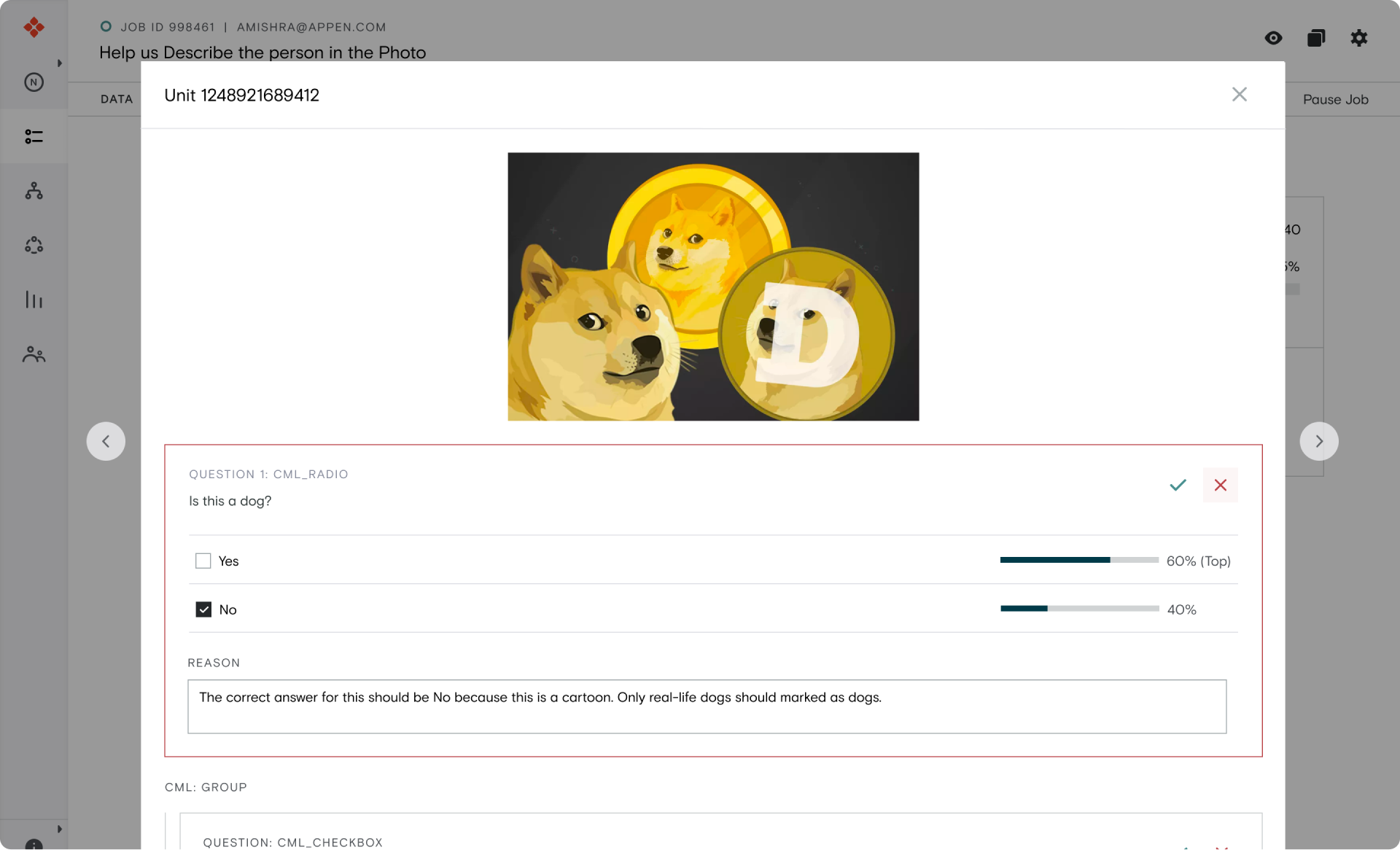
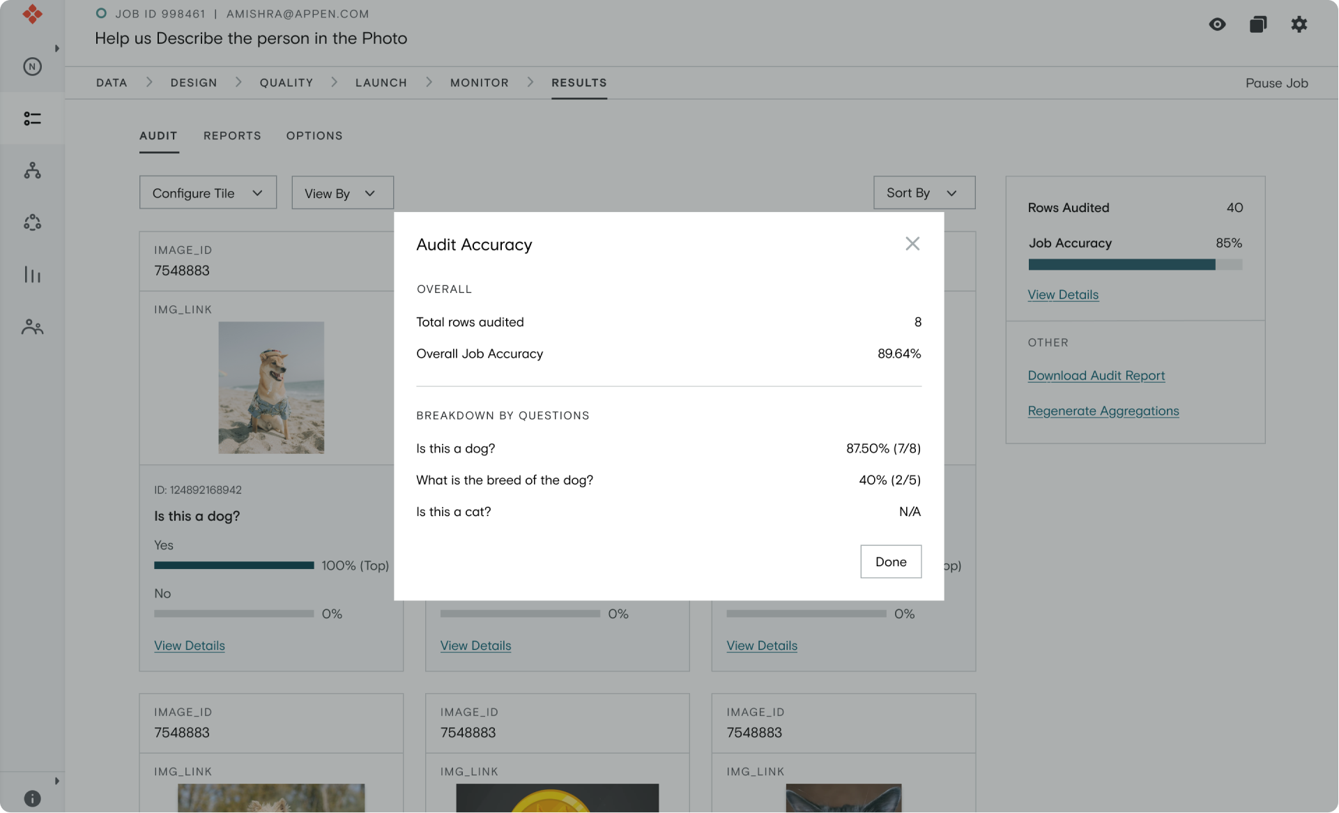
Solution Overview
Impact
≈40%
Decrease in time spent on auditing
>20,000
Data labels reviewed
(2 weeks into beta)
Project Team
Akshat Mishra (Designer)
Kirsten Gokay (PM)
Michael Juster (Backend)
Ron McClain (Backend)
Arthur Nobrega (Frontend)
Luis Ramirez (Frontend)
Responsibilites
Interaction Design
User Research
Product Thinking
Tools
Figma
Jira
Individual Contribution
Design
Product & Engineering
- Lead designer on this project, worked on the project from scratch. Paired up with PMs, CSMs to conduct discovery interviews with customers.
- Interviewed and tested solutions with internal stakeholders as well as customers.
- Proposed metrics to define and measure success for the project to PM and worked closely with the Eng team to ensure correct events get captured in the analytics tool.
Background
To understand how Appen works, let’s walk through an example of a Data Scientist trying to train a Machine Learning model on how to recognize dogs.
To start, the Data Scientist needs a set of labeled images that at the very least contain metadata about whether or not the image is of a dog or not. Generating labeled datasets can be a very labor-intensive task and this is where Appen steps in.
The Data Scientist can upload this dataset on Appen’s platform and create a job for part-time workers around the globe to collect required metadata. In this simple case, the job can contain questions like “Is this an image of a dog” to collect the required metadata.
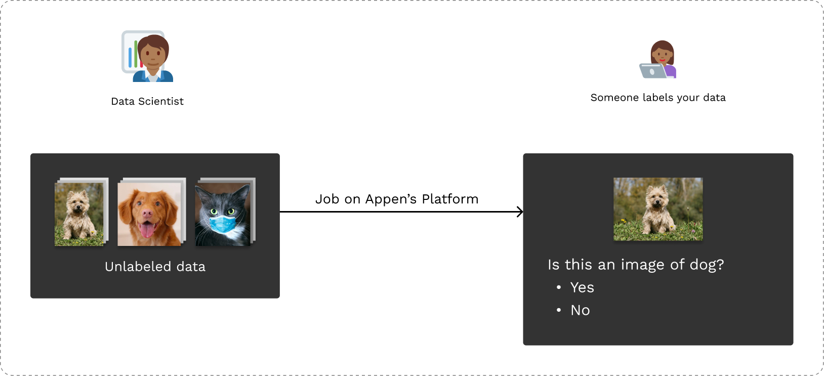
Creating jobs on Appen’s Platform to collect labels
As part-time workers continue working on the job, slowing labels are aggregated on Appen’s platform and a labeled dataset is created which Data Scientists can use to train their model.
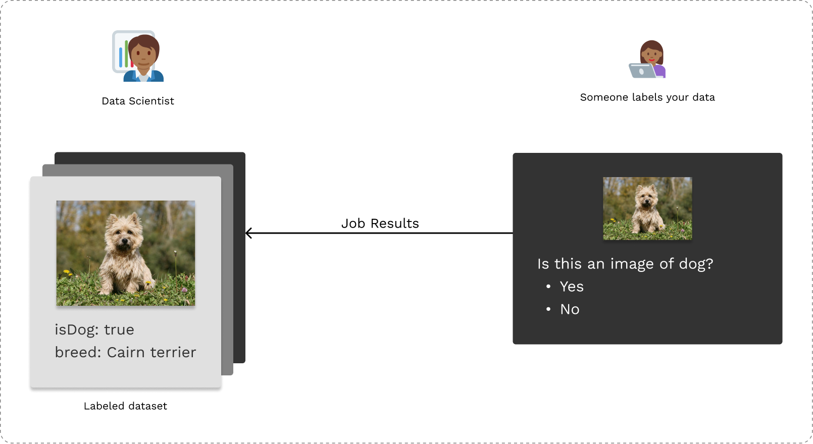
Labeled datasets are aggregated based on results
The Problem
Data Science team typically spend around 5-7 hours every week on auditing, reviewing up to 5000 data labels every week.
Before In-Platform Audit, data scientists could only access labeled results through a report which is generated by the platform. This report is typically in the form of an excel spreadsheet which would look like the following.
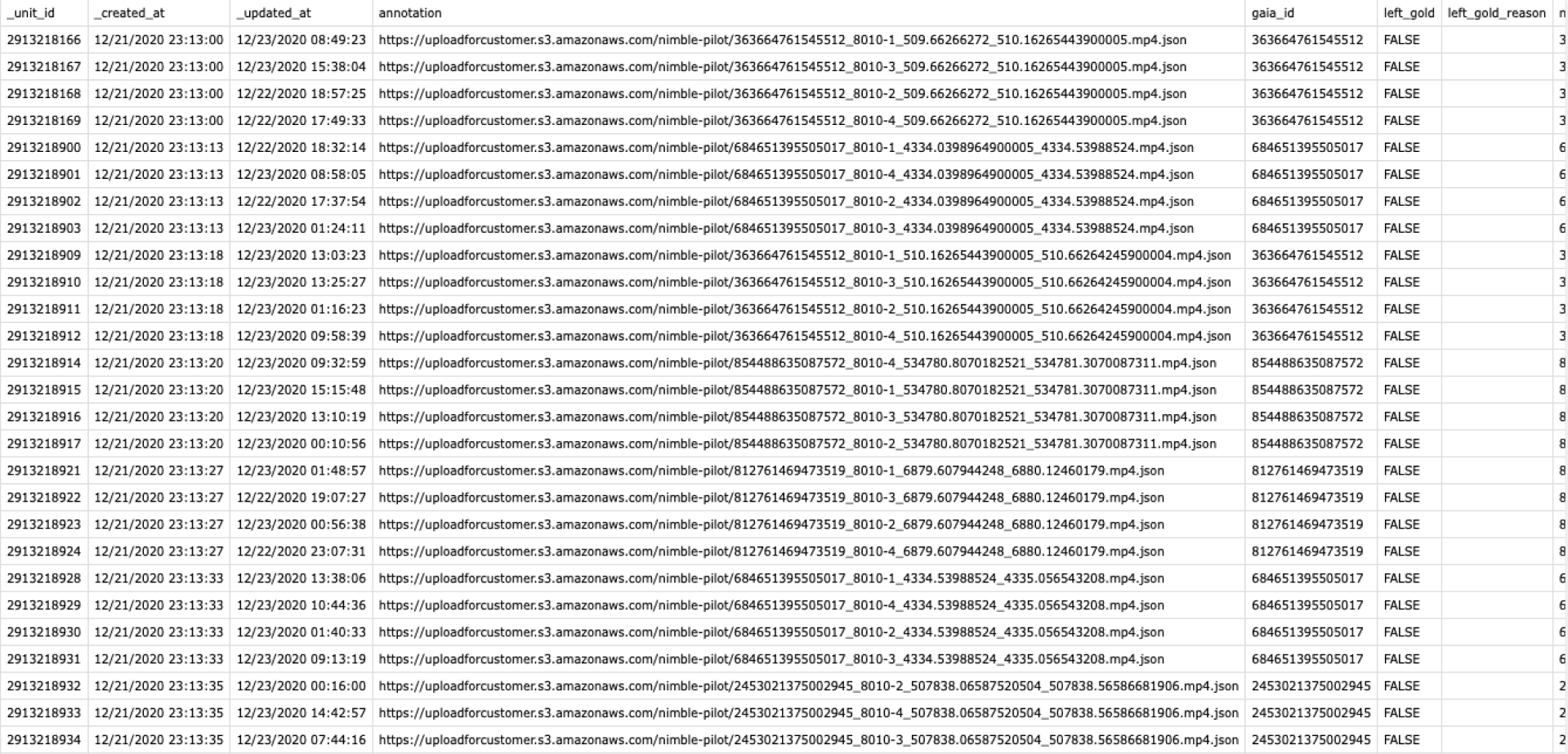
This experience is not great for our users because:
- Data scientists are dealing with large datasets (typically containing around 10,000 rows) which makes the current experience of going row-by-row in a spreadsheet very cumbersome.
- The data labels are typically not just text-based information, therefore, a text report is not the best medium for visualizing data.
- Hard to see patterns and do analysis in this format.
- Hard to find over represented or under represented data labels, which can introduce biases.
Discovery
To empathise with our customers, I teamed up with my PM to chat with 12 Data Scientists working at different companies like LinkedIn, Bloomberg, Giphy, eBay, Twitter, Adobe etc.
Our research questions for this discovery phase were to understand:
- What the key pain points in their current experience?
- What are the key tasks that data scientists perform during audits?
- How much time do our customers typically spend every week auditing?
- How much data are our customers auditing typically every week?
From our interviews, we learned that following from our customers:

Information Architecture
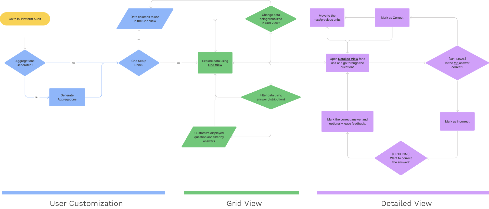
Based on the insights we had from our round of interviews, I collaborated with my PM to design at a high level what the structure of the design solution would look like. It would consisted of two views:
- Birds Eye View: In this view the Data Scientists would be able to quickly browse all the labeled data.
- Detailed View: In this view the Data Scientists would be able to dive deep and look at all the details associated with a data unit.
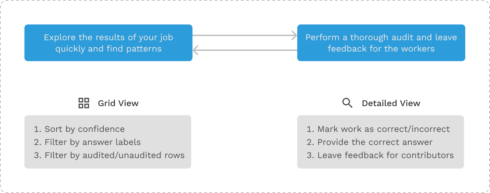
The Happy Path
Once we were aligned on the high level system architecture, I started expanding sections of the two steps while adding the functionality in an Information Architecture diagram.
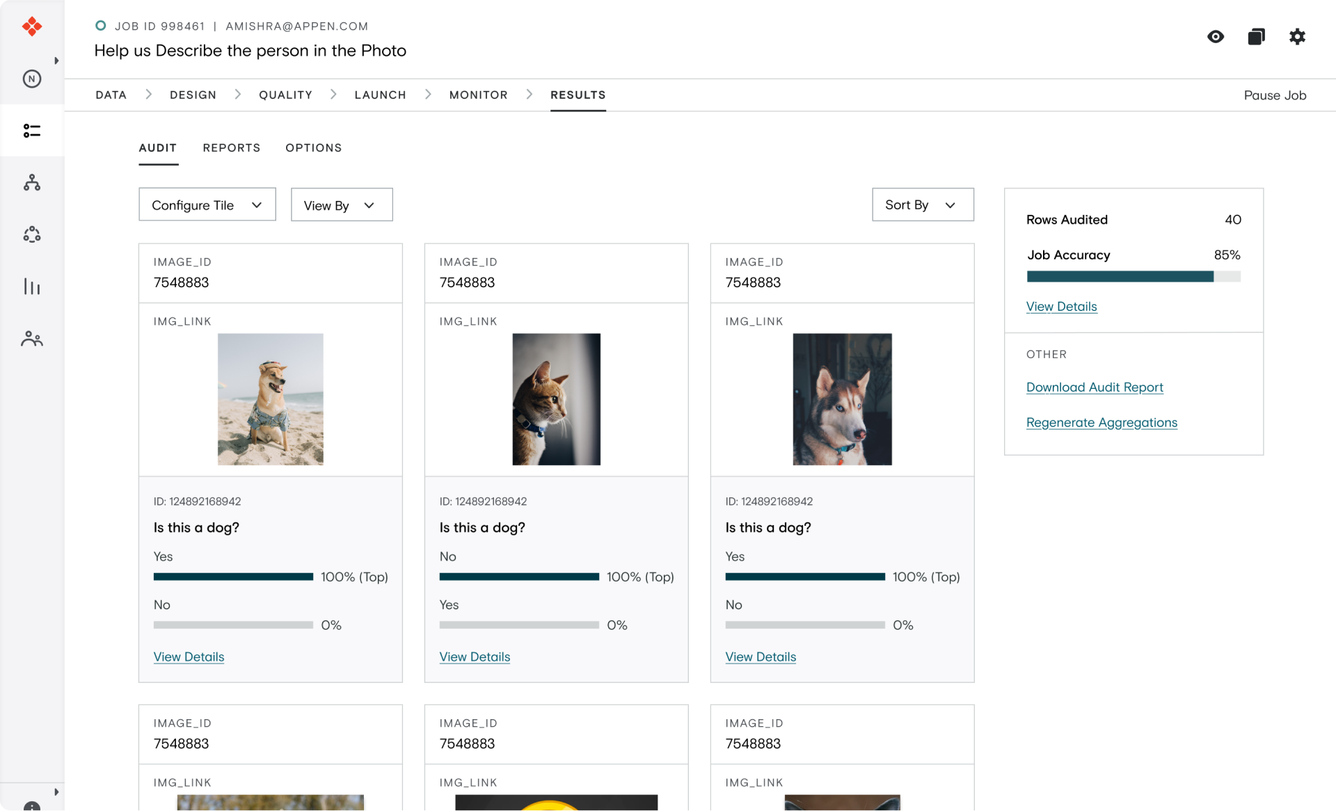
For the remainder of the case study, I will dive deep into my Interaction Design process for building the Grid View which is the birds eye view which allows Data Scientists to explore their datasets and look for patterns in their data.
Designing the Grid View
To start out my design for the Grid View, I went back to the two key actions that Data Scientists would want to perform during their respective auditing flows:
1. allow users to explore data quickly
2. ability to sort, filter and search labels
These goals can be supported in different ways based on the type of data labels we are working with. To understand in detail the different types of data our platform supports, I talked to PSEs (Professional Service Engineers) and the different types of use cases we support I talked to CSMs (Customer Success Managers).

From my chats, I learned that we have a lot of different types of data, job uses cases and furthermore any of the data types can be combined with any other types to create a completely custom job!
Ideation
After developing a deeper understanding of the problem space, I started thinking about the different high level approaches we can take for designing the Grid View.
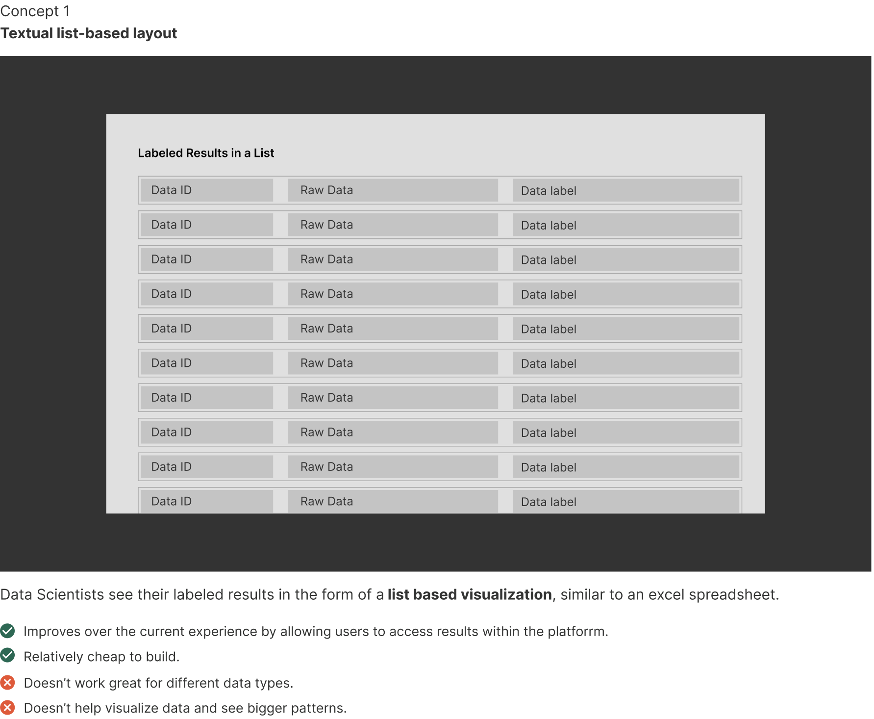
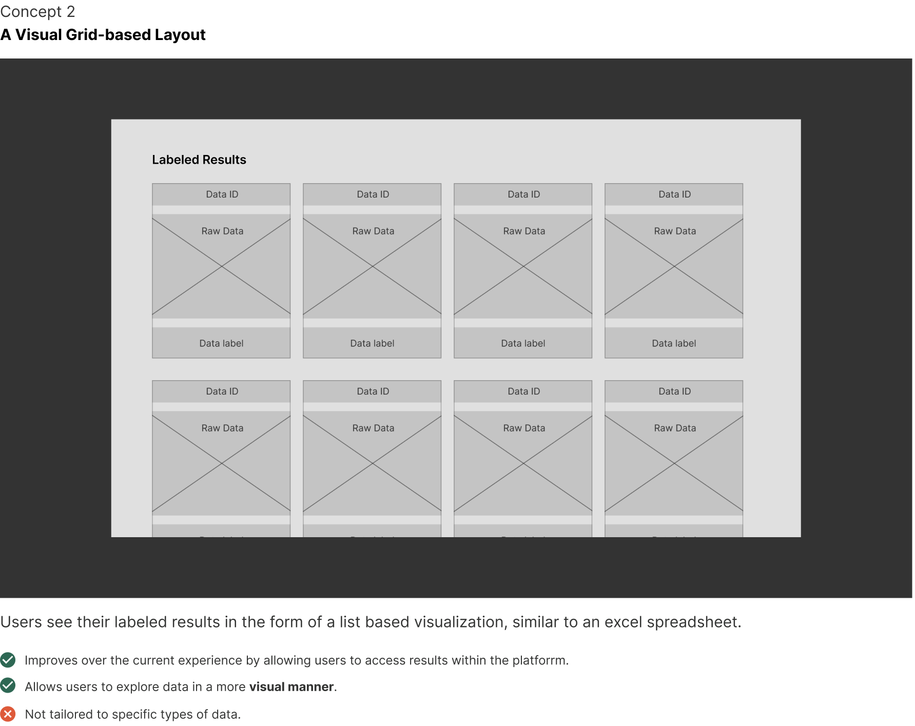
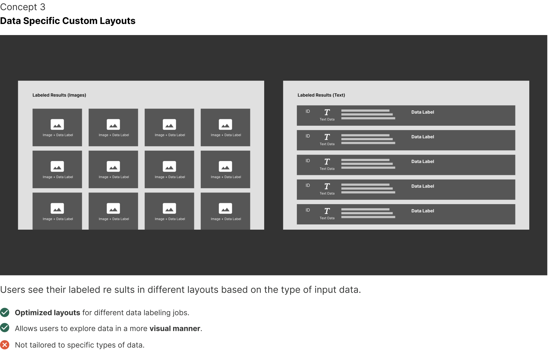
At a high level, three approaches stood out to be as viable candidates:
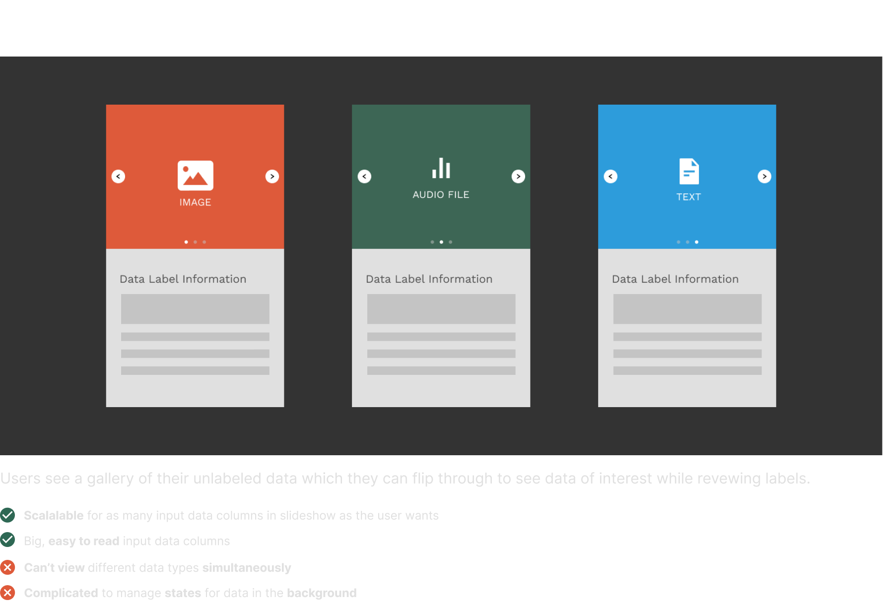
1. Textual list-based layout
2. A Visual Grid-based layout
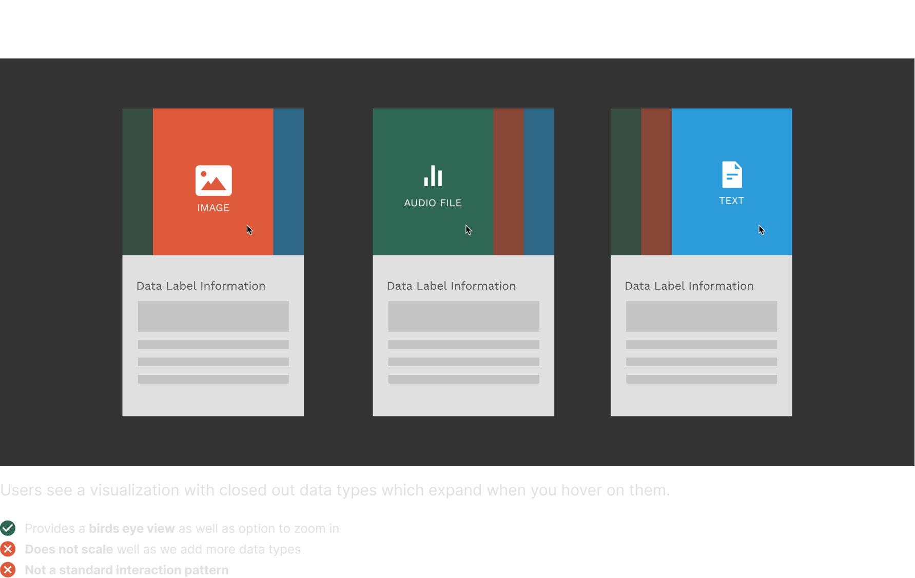
3. Data-type Specific Visualization
Tradeoff Analysis
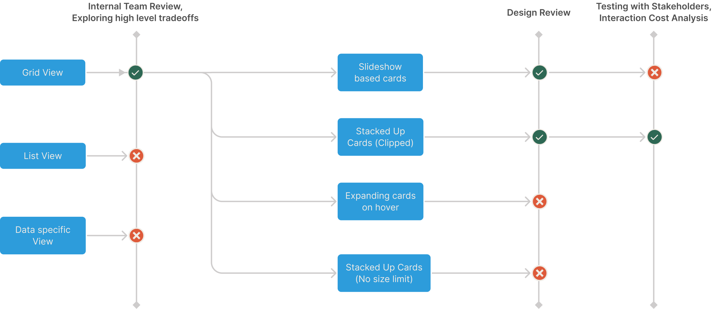
To finalize on a high level approach for the solution, I presented the different approaches to my team. After exploring the different tradeoffs, we decided to move fast and chose Concept #2 after exploring different factors like:
- the auditing experience
- scalability of approach
- complexity of solution
- engineering costs
- impact
Post MVP, we would slowly add more Data Specific layouts from Concept #3 to improve the overall user experience for our users.
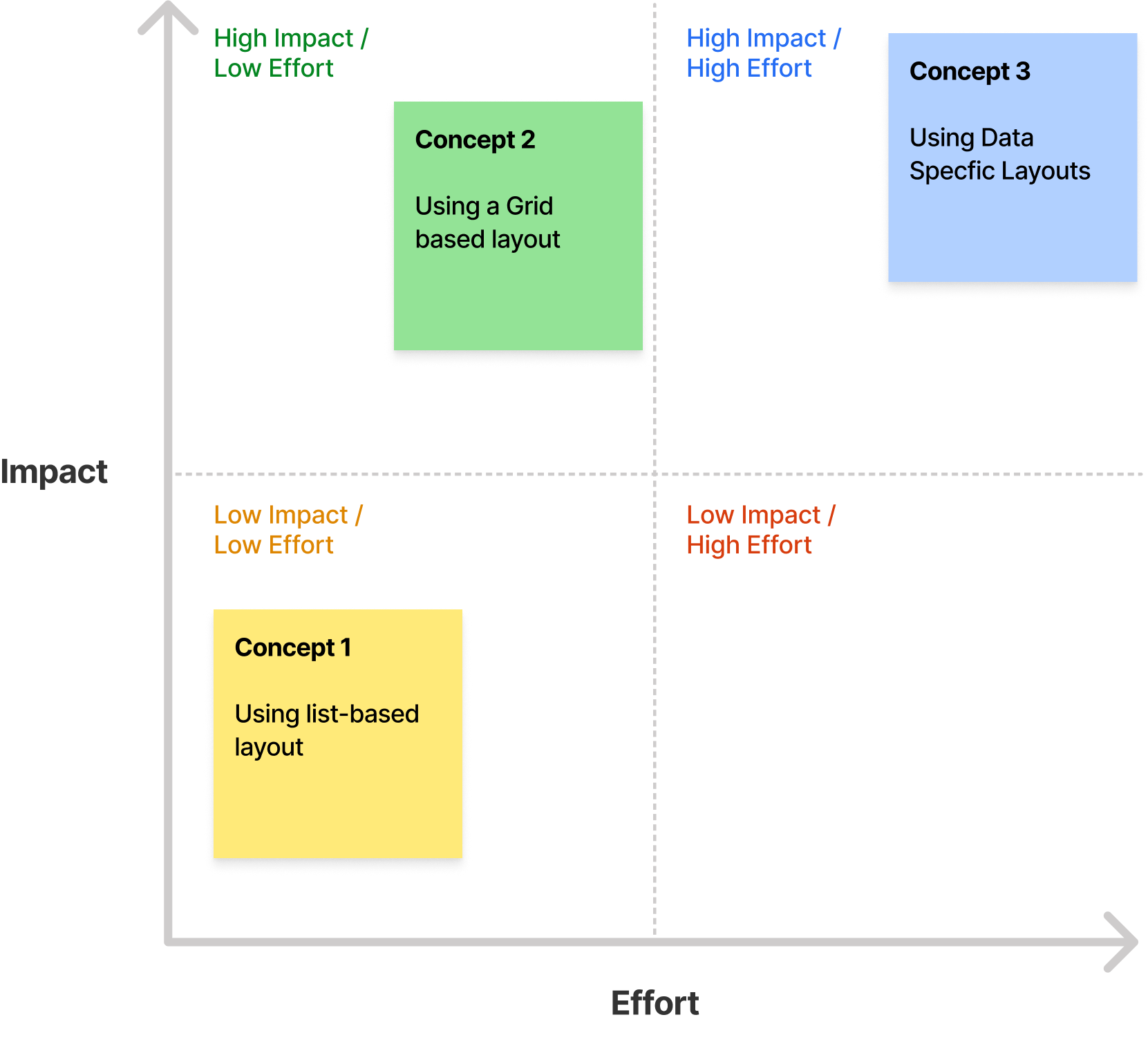
Exploring the Grid Visualization
When reviewing the results, there are two pieces of information which are necessary to have while auditing
1. Original Data
2. Label
For simple use cases, there might only be one type of data which was labeled. e.g. Labeling dogs in an image.
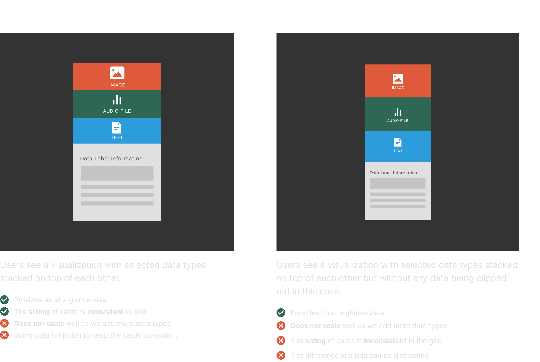
However for other more complex types of jobs - there can be different types of data which need to be labeled or be looked at together to label. e.g. Search relevance labels need to look at the query and the result where either can be text, images, video or any other type of data.
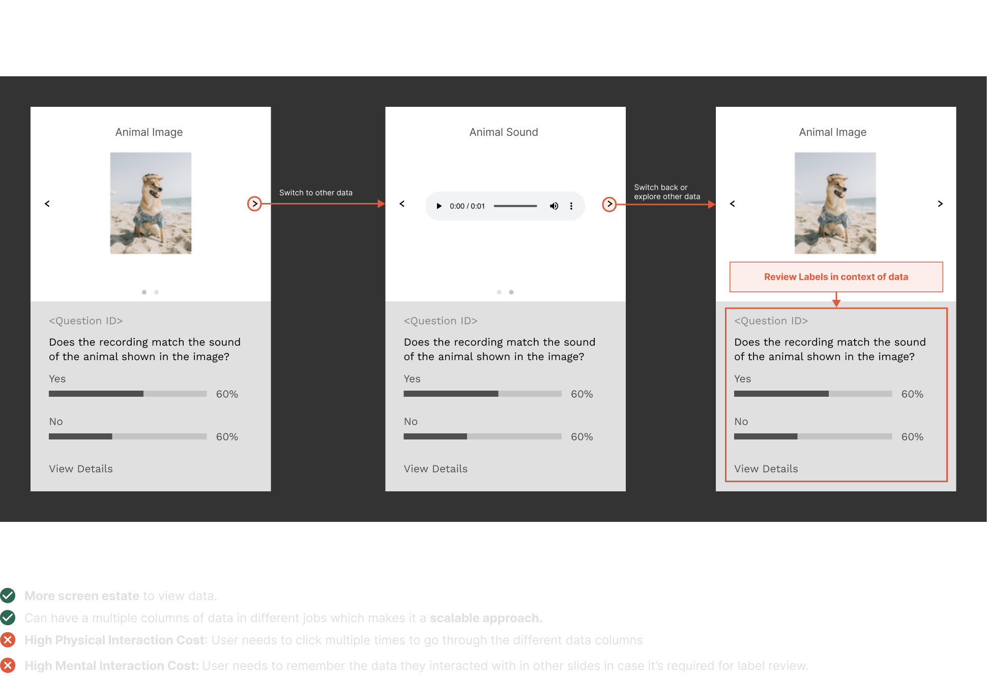
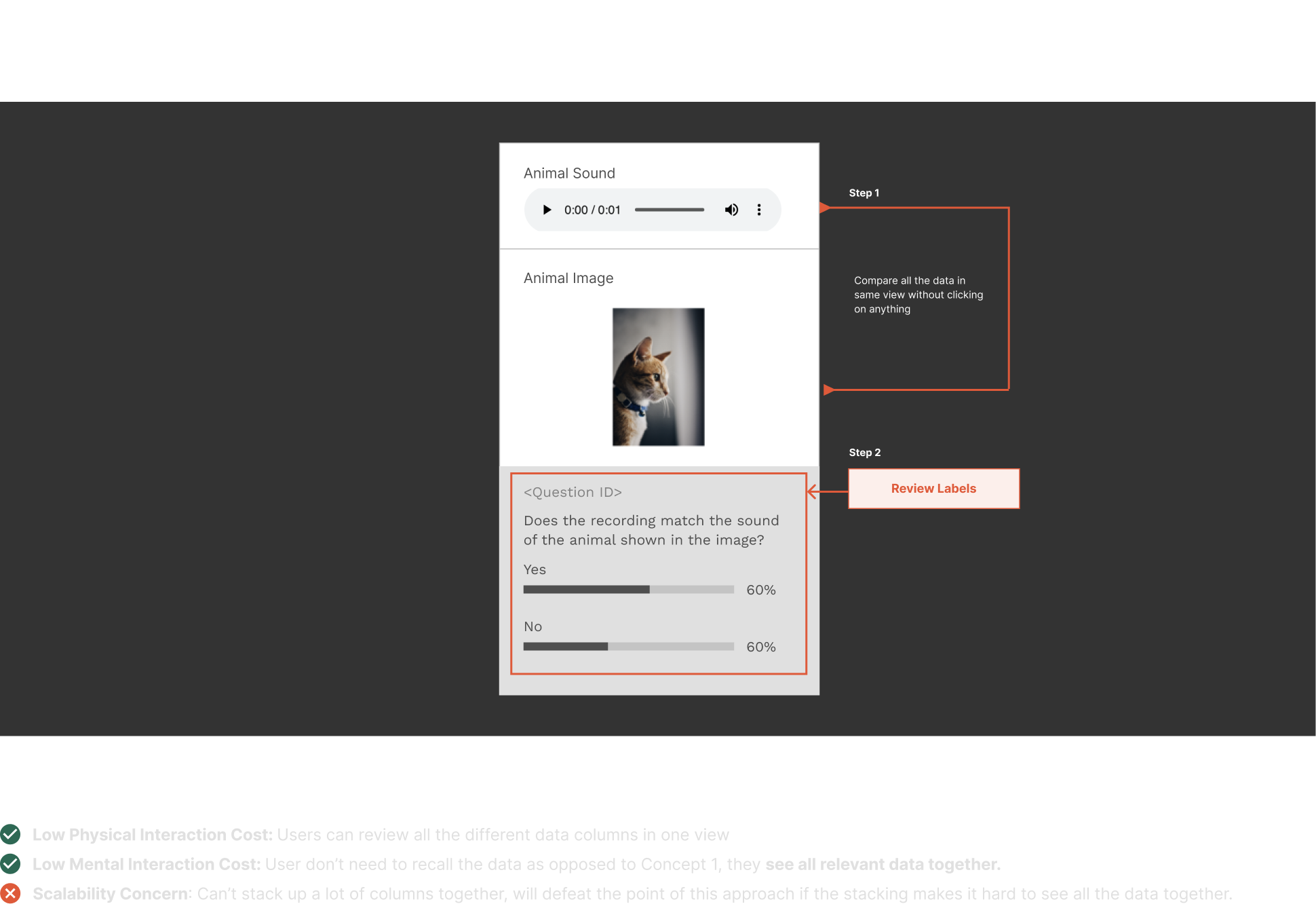
Here are some of the interactions I explored for these complex use cases:
After reviewing these four approaches with my team and based on feedback in Design Critiques, we decided to move forward with Concept 1, and Concept 3.
Bringing two concepts to life
To evaluate the two concepts, I started mocking these concepts with real data from real data labeling jobs live on the platform.
I evaluated the concepts by testing with internal stakeholders and evaluated the designs on the following criteria:
1. does it scale for different auditing workflows?
2. does it scale for different types of data labeling jobs on the platform?
3. interaction costs: physical and mental costs
Final Concept for MVP
After testing with internal stakeholders and after evaluating the concepts on the basis of our criteria, we decided to go with Concept #2 - Stacked Up Data.
Iteration Timeline
Final Designs
So far in this case study, I've explained my Interaction Design process only for the grid view. If you're interested in learning about the design process for rest of the components feel free to drop me a line!

Grid View

Detailed View

Quickly check the accuracy of your labels
Measuring Success
To measure the state of the audit processes, we captured benchmarks using surveys to understand how often our customers were auditing, how many labeled data units were our customers auditing, and how much time they were spending on audit every week.
On comparing these benchmarks with the data we obtained during our beta, we noticed a 40% decrease in the auditing time for our customers.
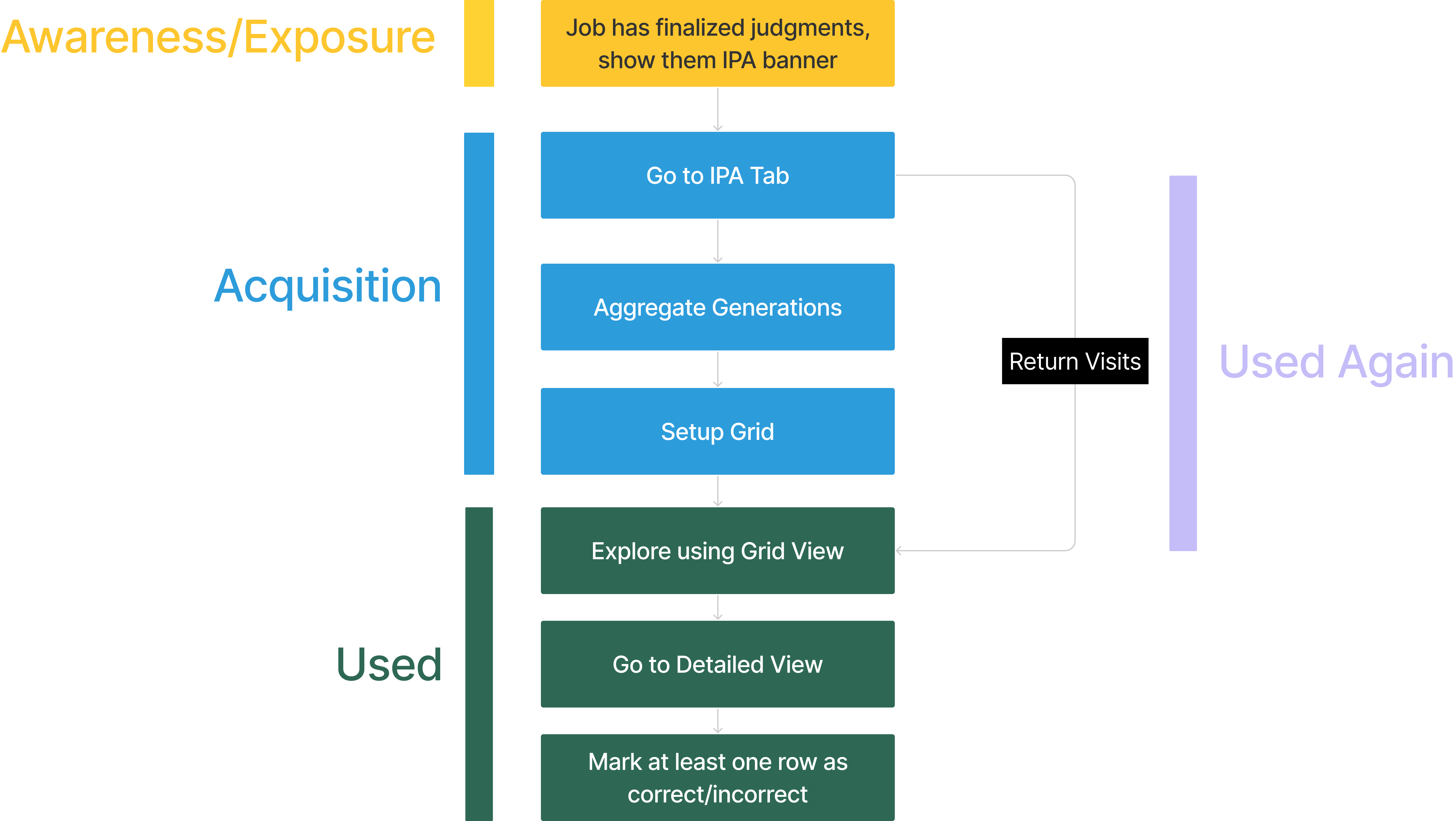
To measure engagement of our customers, in the beta we've been tracking how many units of data have our customers audited. Moving forward we want to use a Feature Adoption funnel to understand the usage behavior of our customer.
Design Work
Appen RebrandProject type
Sair: Collaborative Trip PlanningInteraction Design
© Akshat Mishra
Currently working from the Mission District, San Francisco

