Appen Rebrand
Designing a scalable design system to rebrand Appen while driving UX and Front-end improvements.
In 2020, Appen acquired Figure Eight and launched a new brand to appeal to its customer base. I collaborated with another designer on the team to create a new visual language that translate this new marketing brand to product.
The company’s wider goal for this project was to have a unified brand for Figure Eight and Appen. However we decided that we wanted to do more than a simple logo swap.
We had three key objectives for this project:
- Create a new Design System that translates the new Marketing brand for the new unified product.
- Drive UX improvements for the SaaS platform as we were rebranding.
- Create standards to improve design-developer collaboration across the companies.
tl;dr:
Business Problem
Design a new Visual System for Appen's SaaS platform to have consistent branding across the Marketing website and the AI Platform. Furthermore, create a system which is extensible and can be applied to rest of Appen's suite of products.
Product Goals
- Create a new Design System to implement the new visual brand across the suite of Appen Products.
- Drive UX improvements across the SaaS platform to get customers excited about the rebrand.
- Improve Design-Engineering collaboration by creating shared conventions and socializing the new Design System.
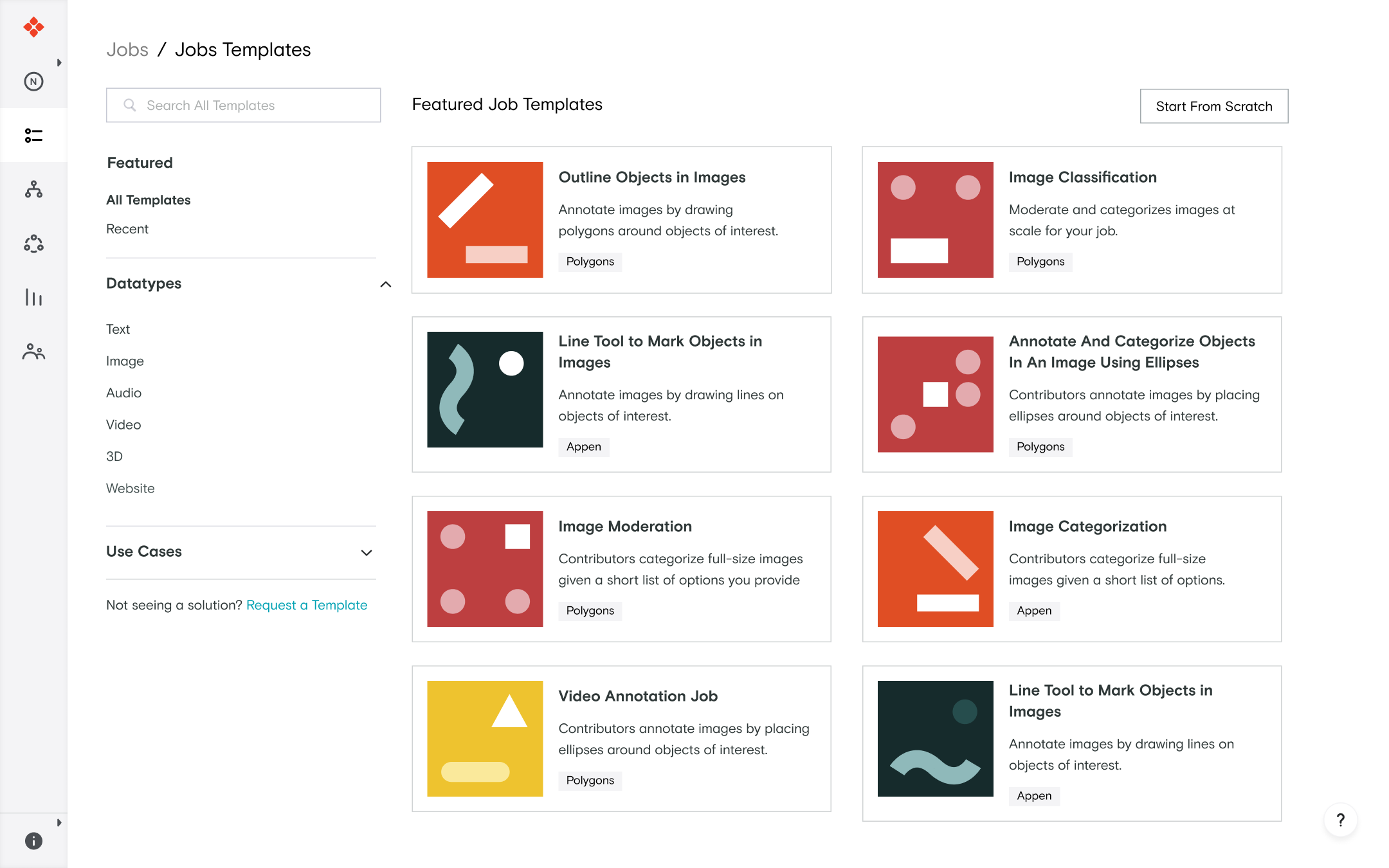
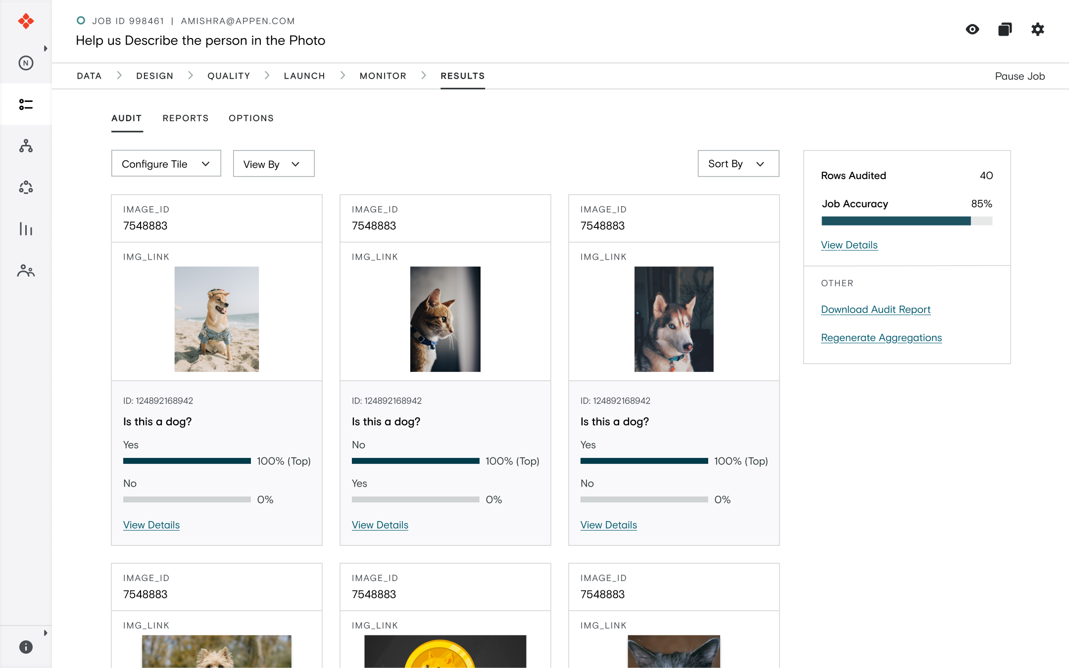
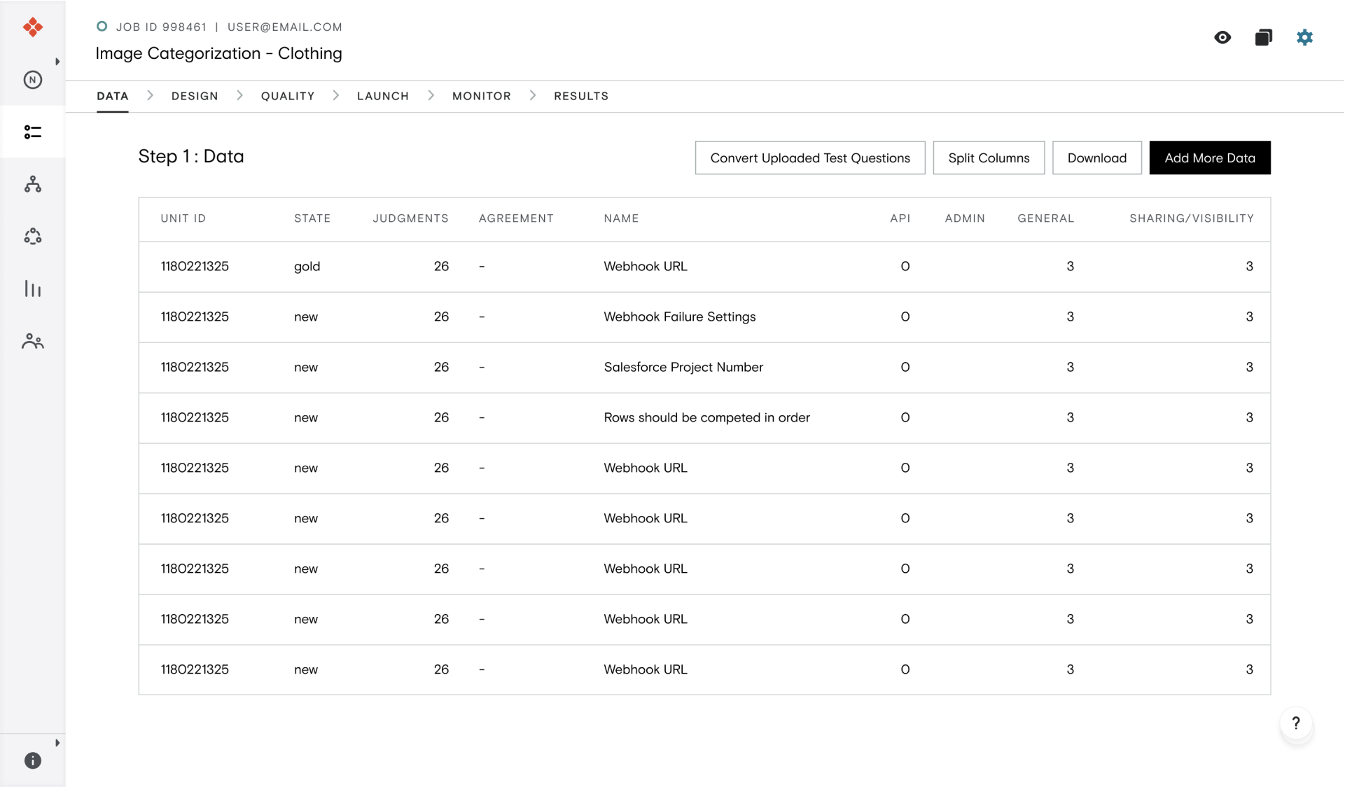
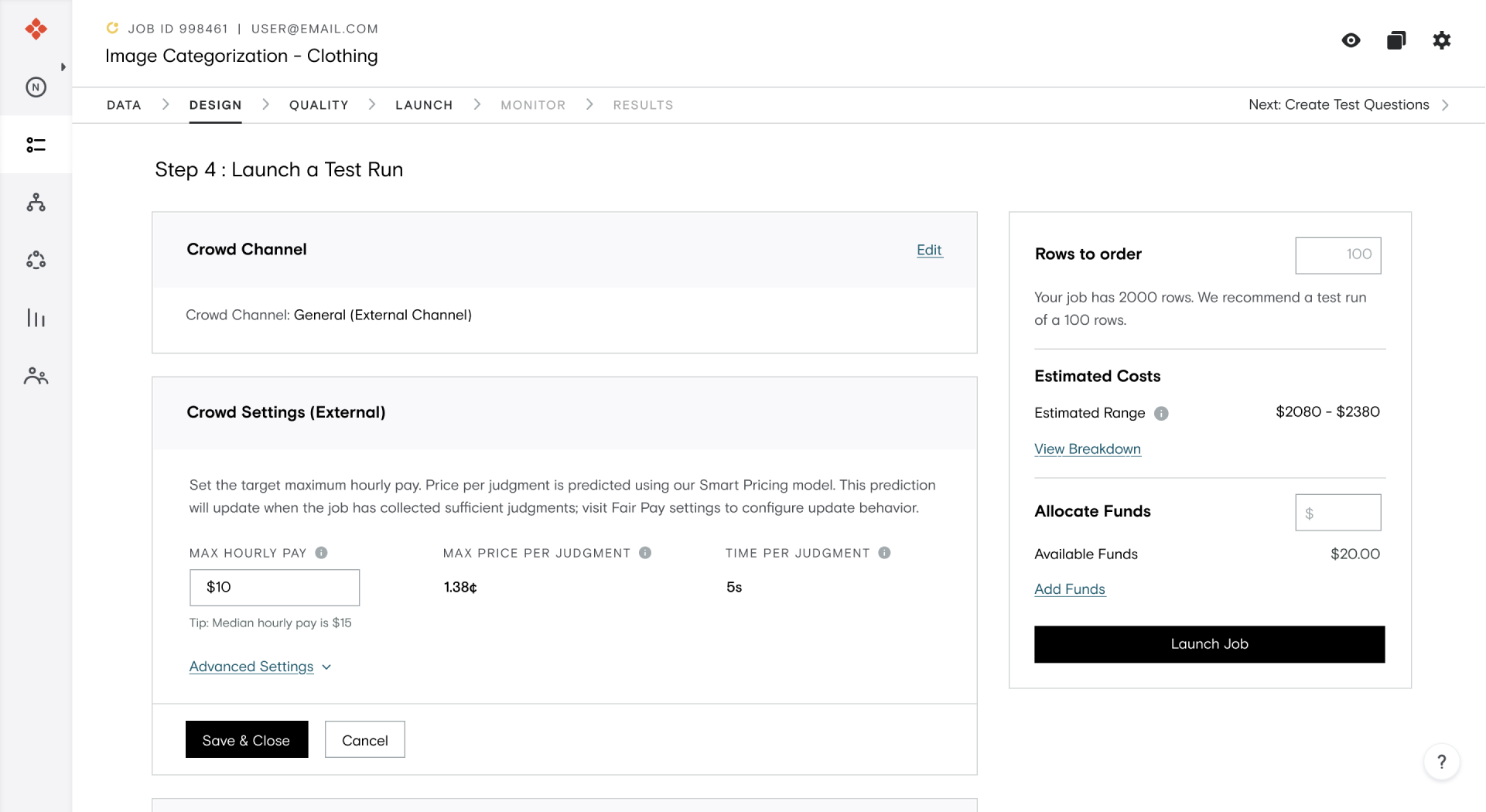
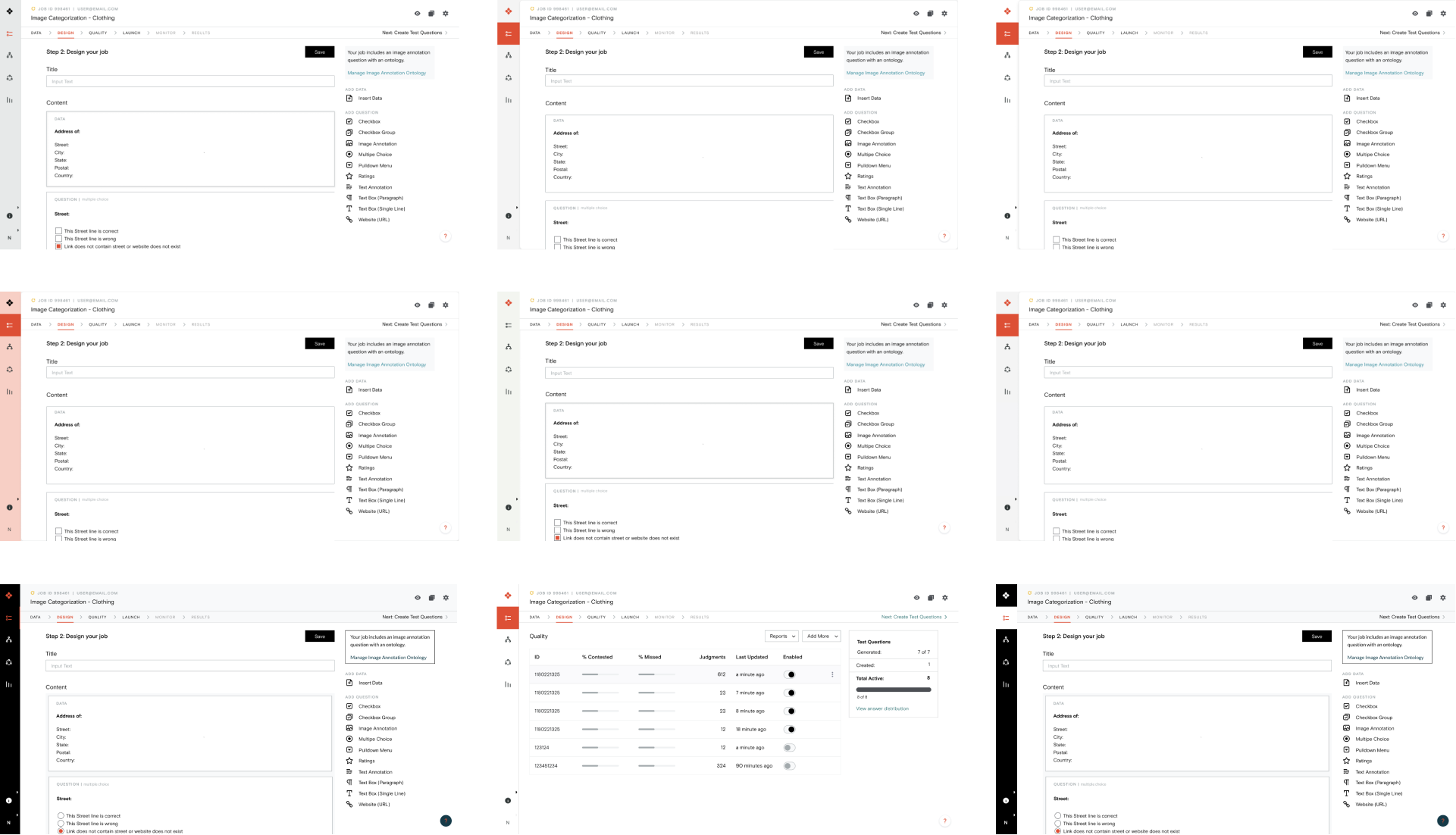
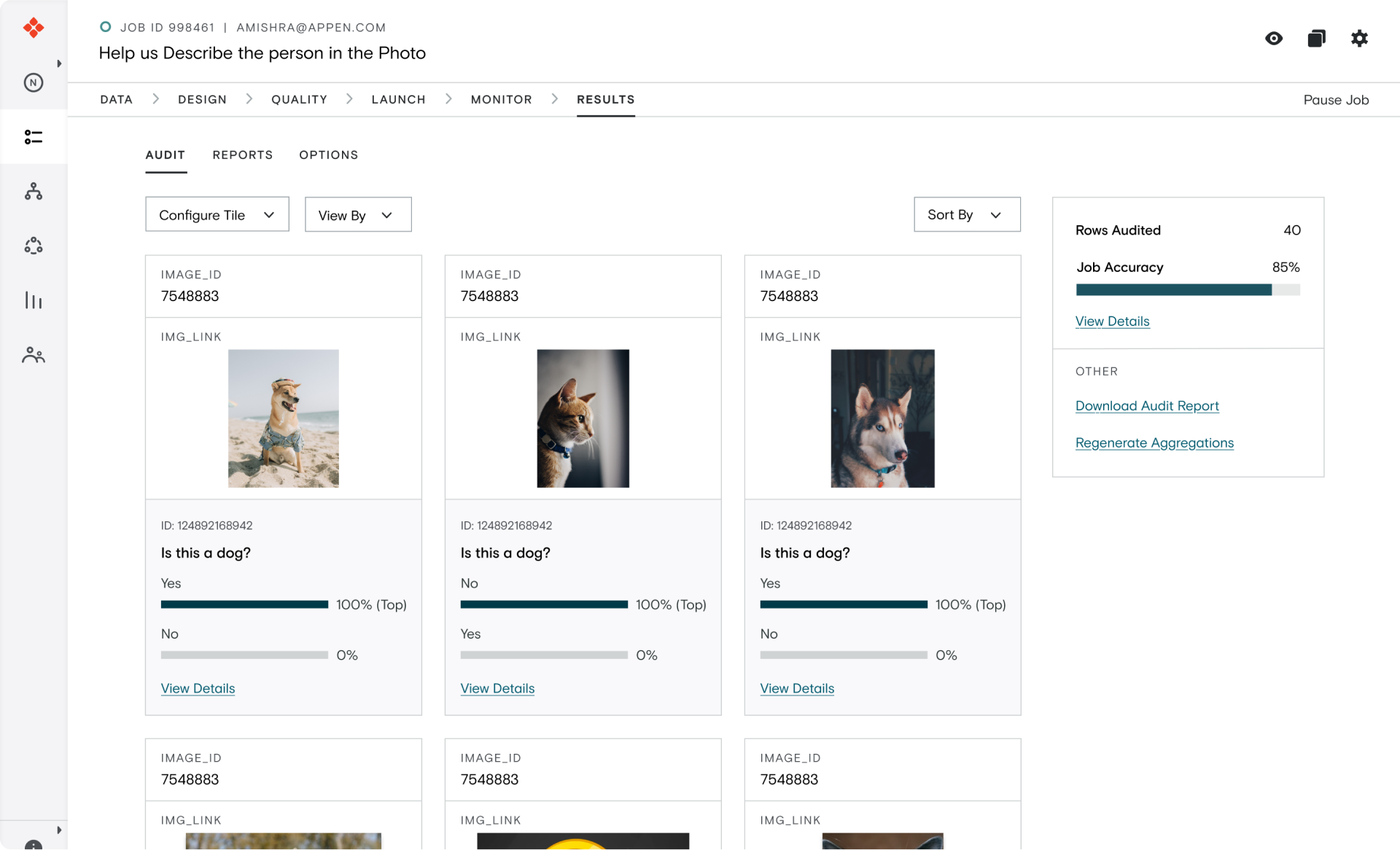
Sneak Peek of the rebranded platform
Impact
- Designed a new Design System from Scratch.
- Collaborated with Engineers to understand their pain-points to create shared naming conventions across design tokens (typography, colors) and components.
- Ran performance audits using Lighthouse (Chrome Developer Tools) to identify redundant styles in codebase, and collaborated with Engineers to improve efficiency by 93%.
- Fixed all color contrast issues on the Design System to improve accessibility of the platform. Worked closely with PM to prioritize tech debt related to accessibility.
Project Team
Akshat Mishra (Designer)
Nidhi (Design Manager)
Maggie Cai (Designer)
Michael Lucero (PM)
Ilnur Farukshin (Front end)
Oleg Shuralev (Front end)
Marat Adiyatullin (Front end)
Responsibilities
Visual Design (Heavy)
Interaction Design (Light)
User Research (Light)
Product Strategy (Medium)
Tools
Figma
Jira
Individual Contribution
Design
Product & Engineering
- Collaborated with another designer to audit the old platform to identify key usability issues and document the usage of components.
Designed a new Typographic Scale - Conducted a remote card sorting research to redesign and improve the information architecture on Settings page
Redesigned high touch point pages like Job Data, Job Launch, Account, Settings etc.
- Worked with PM and Engineering to understand constraints and create a release plan.
- Worked closely with Engineers to create shared naming conventions.
- Conducted an Audit on the platform using Chrome Dev Tools (Lighthouse) to identify areas for improvement and redundancies.
- Identified key redundancies in the codebase and worked closely with Engineers to improve efficiency by 93%.
Introduction
In the beginning of 2020, Appen started the transition to merge with Figure Eight (acquired in 2019). One of the first initiatives of this long project was to merge the brands of the two companies and create a unified brand.
To kickstart this process, Appen updated it's marketing brand to create a new brand that is more modern, and resonates with potential customers in the AI Data Labeling industry.
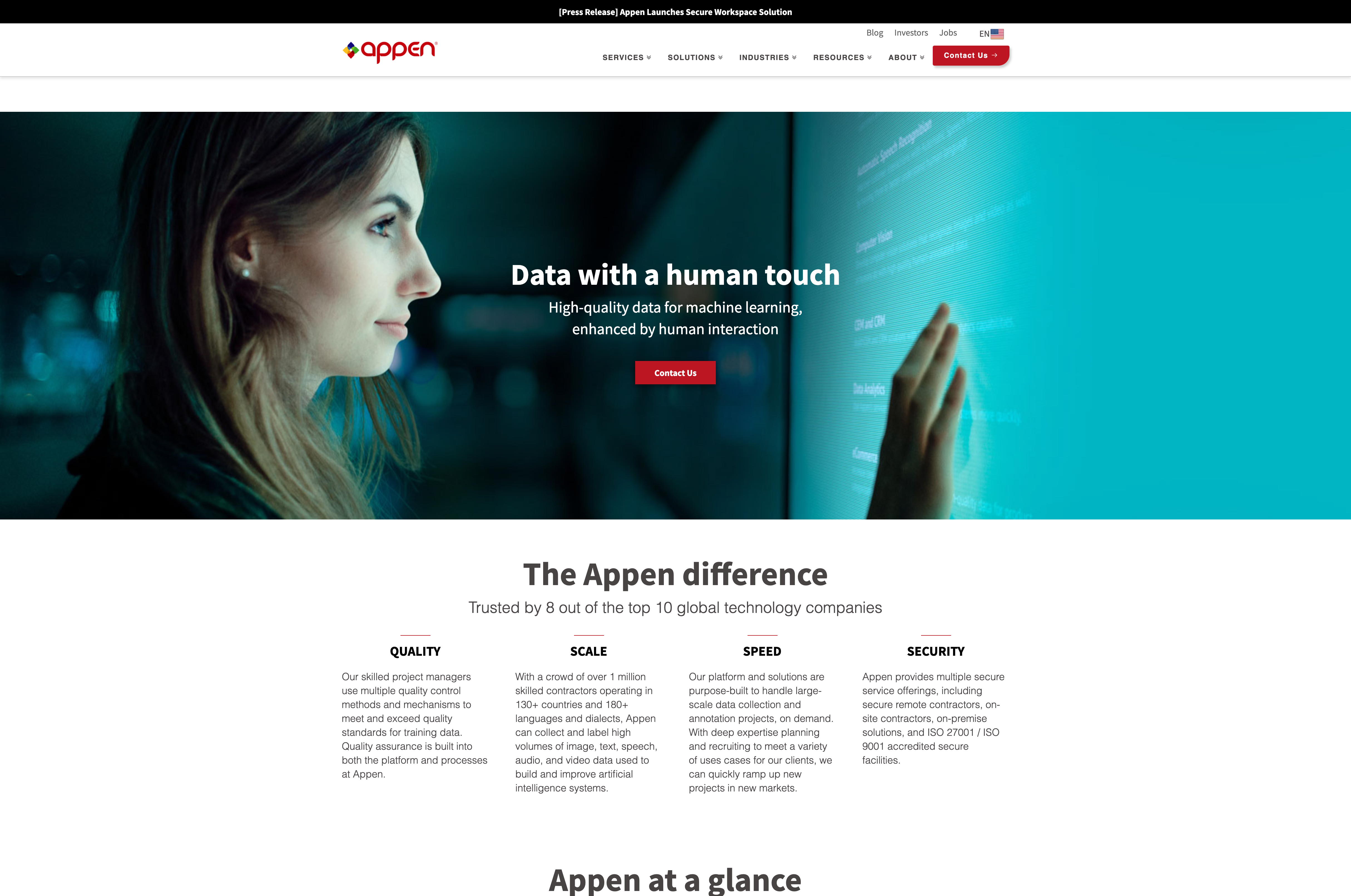
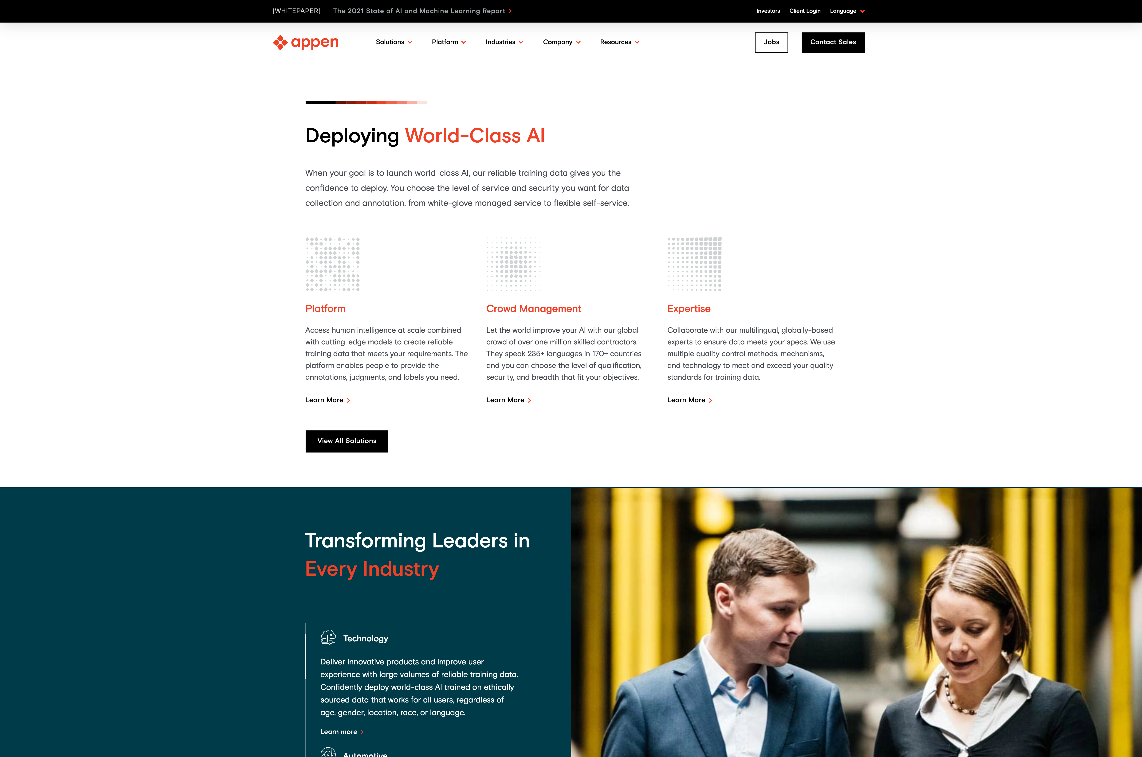
Old vs New Appen Brand
With the new Marketing brand in place, the overarching goal for the product team was to update the SaaS platform in accordance with the new brand.
Setting Goals
Early during the project, we decided that as team we wanted this project to be more than a simple logo and color swap. We realized that as our front-end engineers will be touching almost every aspect of the platform, we can use this opportunity to improve the experience for our customers.
The three areas we decided to focus on were:
- Rebrand Product: We wanted to create a new Design System to rebrand the platform and create a consistent look across marketing and product.
- Improved User Experience: We wanted to improve the experience for our customers by driving light-weight UX improvements.|
- Improved Design-Engineering Collaboration: In the past, the Design System used in design tools was inconsistent with the engineering design system. We wanted to take this opportunity to build standards and improve processes there.
Design Audit
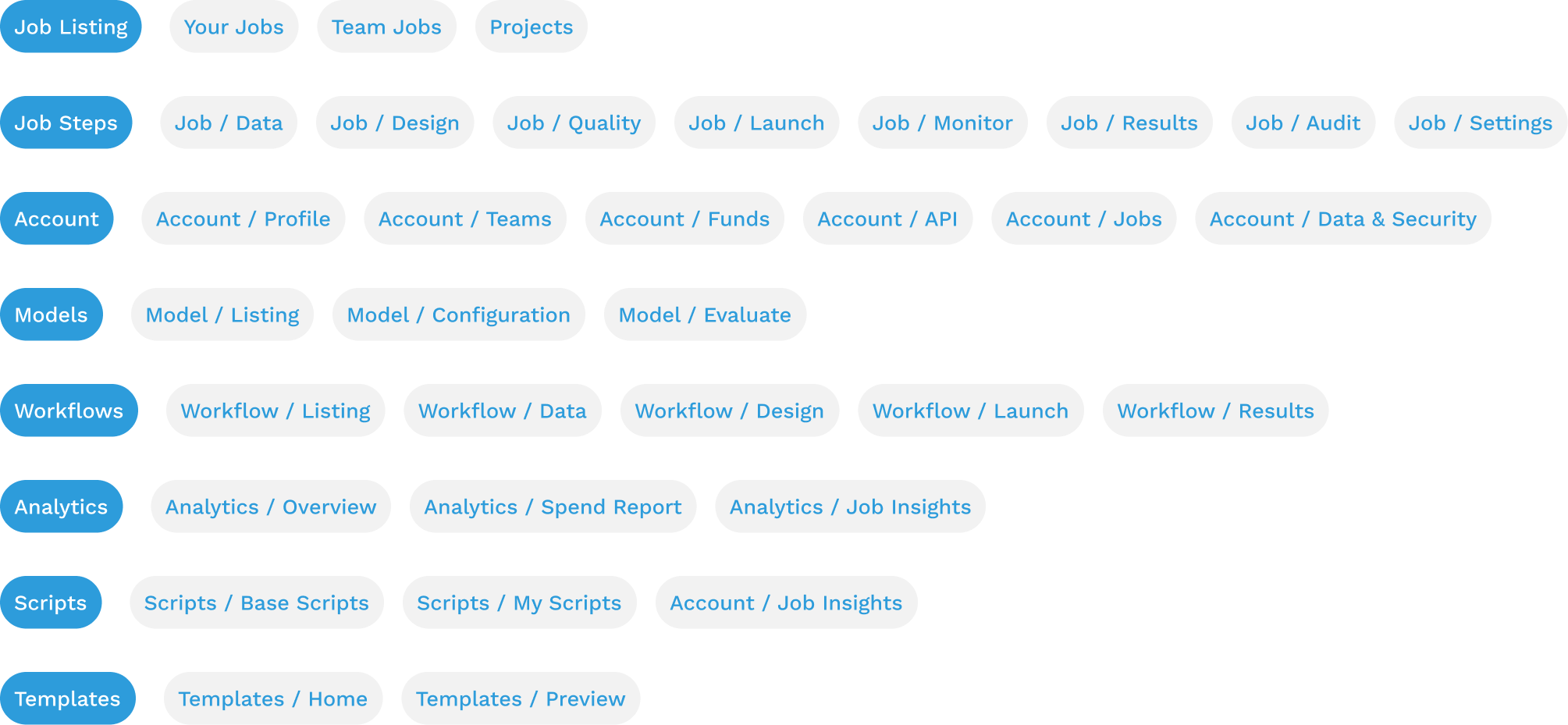
To rebrand and improve the UX, we decided that we should conduct a thorough audit of the platform. This would help us identify key problem areas from a visual as well as interaction design point of view. To start we created an information map and used it to divide the pages to be audited between us.
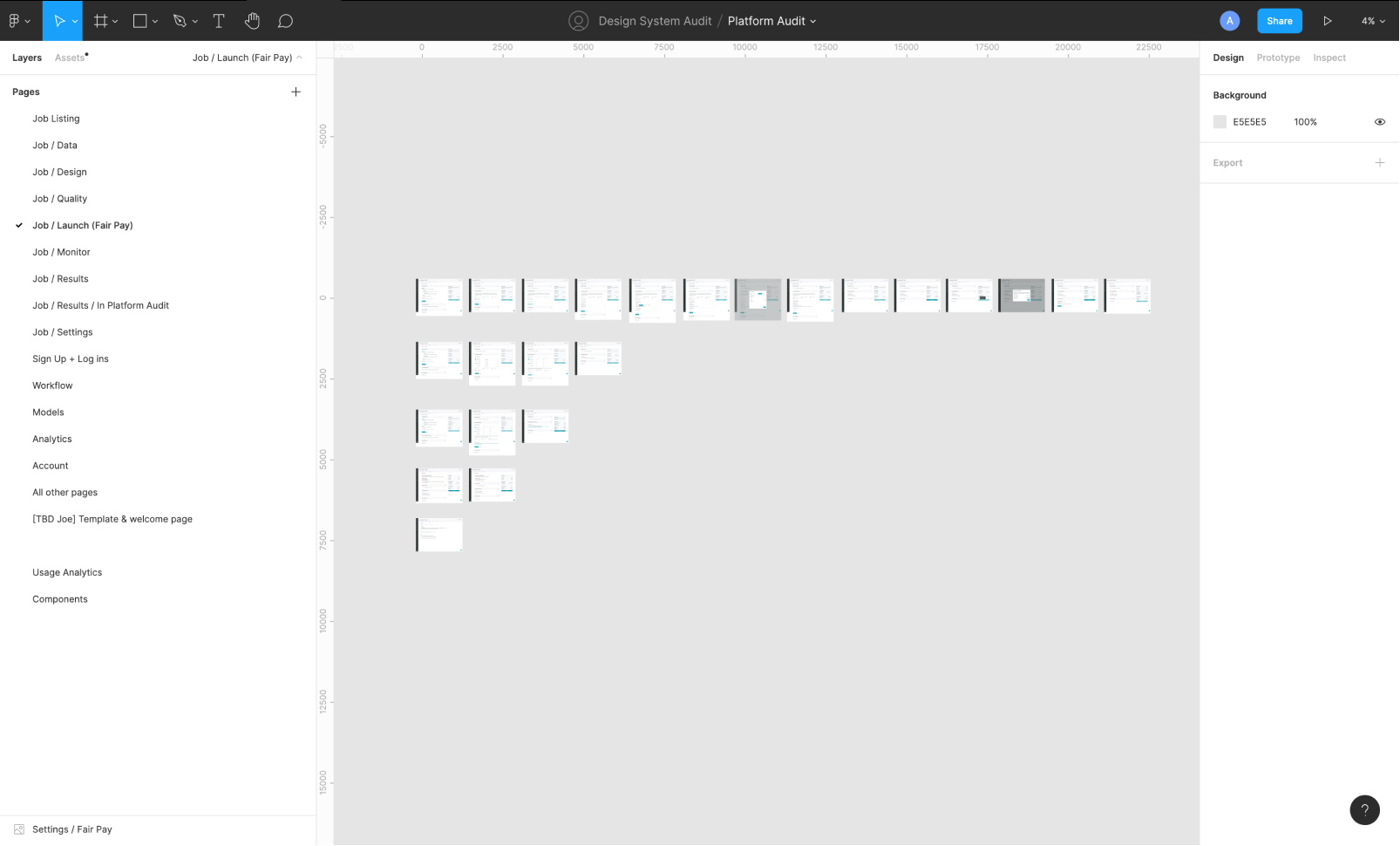
To audit, we took screenshots of all the pages and created a catalog of components. From there, we identified which ones need to be consolidated and redesigned.
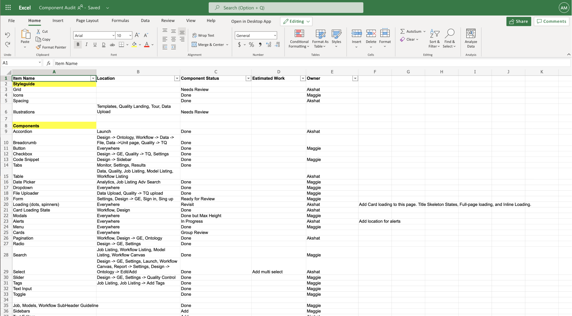
Documenting review status
Engineering Audit
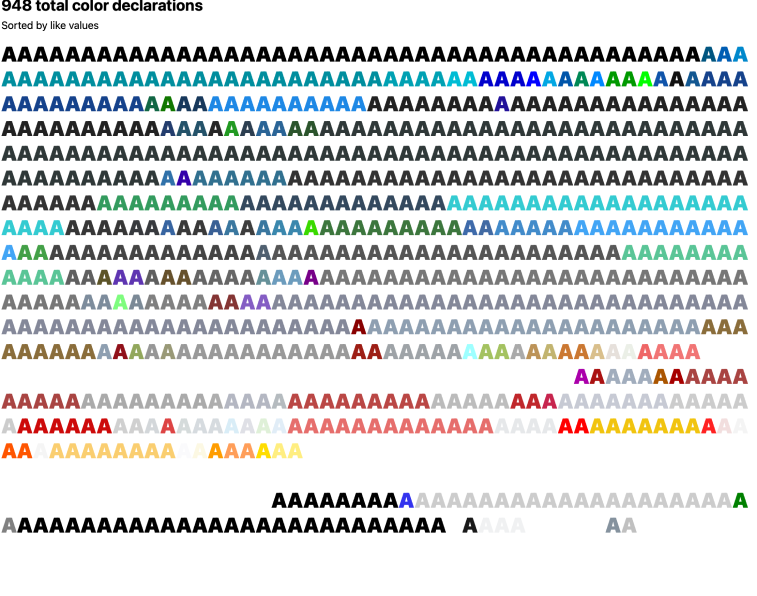
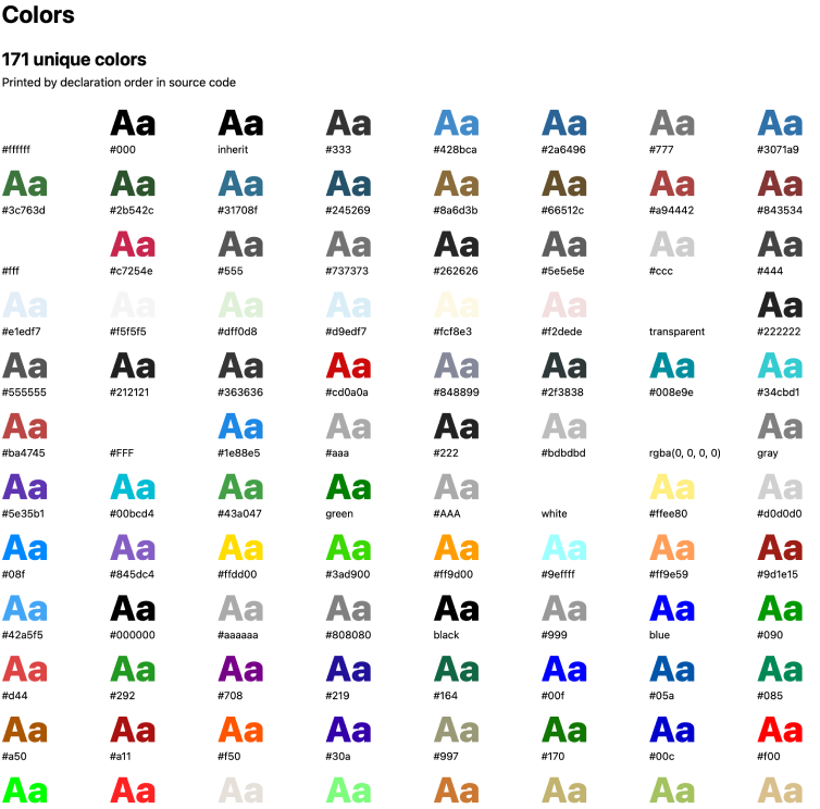
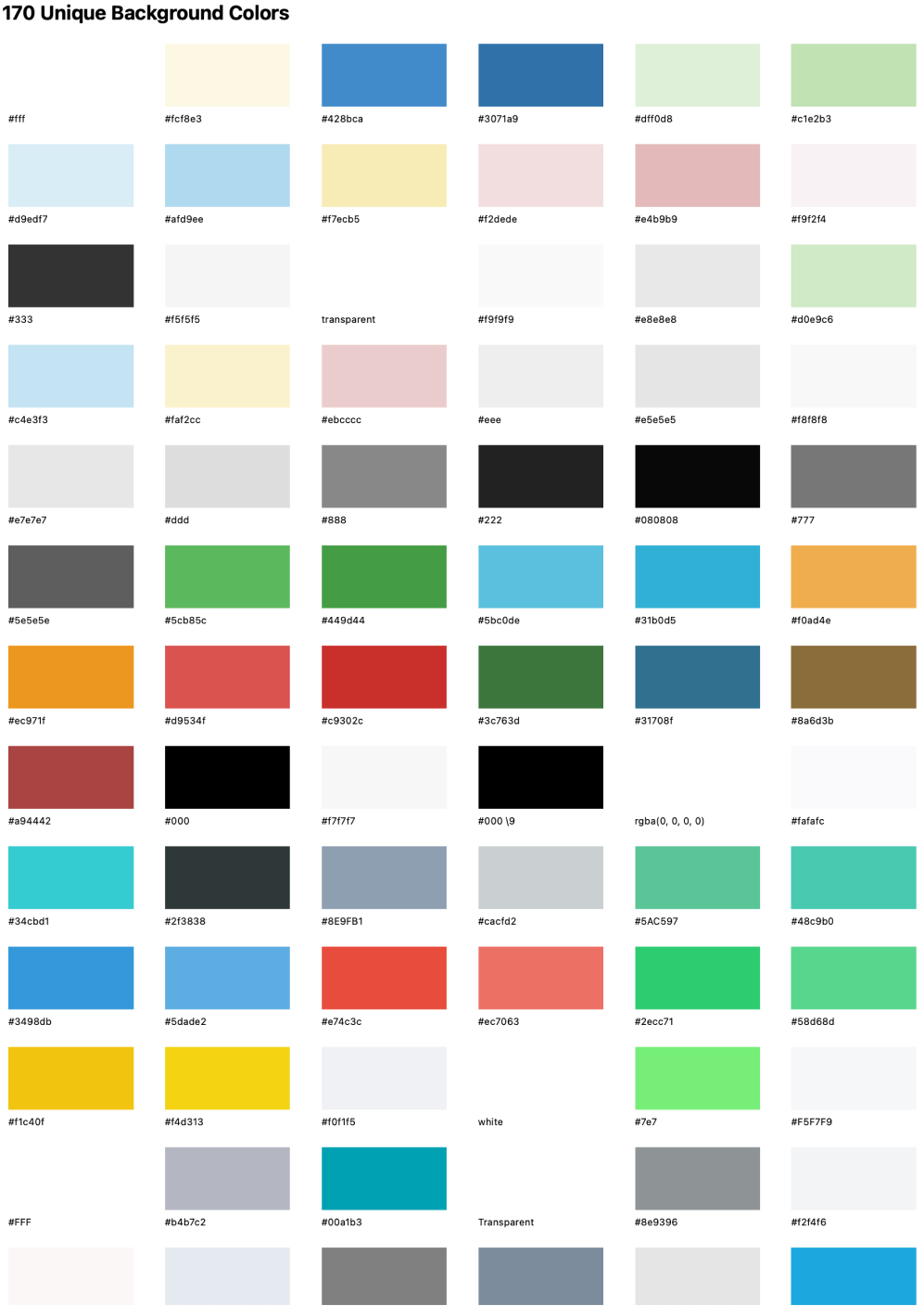
To understand the different design related issues on the front end, I conducted a CSS Audit to understand the redundancies that had crept in over the course of multiple rebrands and redesigns.
Design Explorations
At the end of the audit, I started exploring what the platform would look like with the new color pallete.
Design & Build
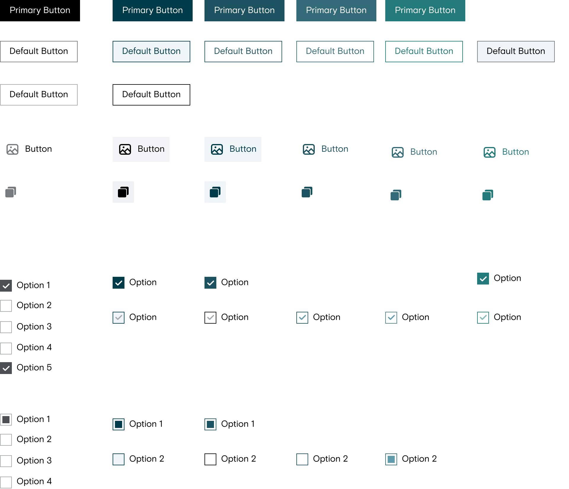
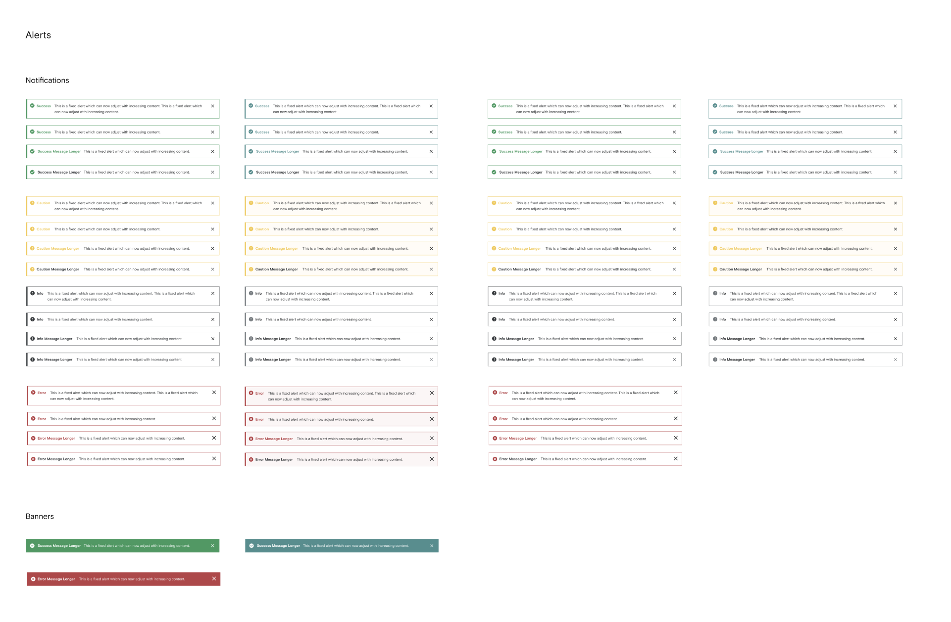
After infinite round of iterations and critiques, we had the finalized components which we started putting together in a Design System. At this point I worked on the following things:
- Redesign high touch point pages such as Settings, Job Launch, Audit etc.
- Collecting data and feedback on the new designs from internal and external users.
- Create components along with other designers.
- Sync up with engineering to create a common way of organizing components and colors.
- QA the final designs in testing environment
- Work closely with the PM to create a phased approach for bigger UX improvements.


Design Work
IPAProject type
Sair: Collaborative Trip PlanningInteraction Design
© Akshat Mishra
Currently working from the Mission District, San Francisco

